Wishing you and yours more treats than tricks.
What makes certain images spooky? Subject matter, of course – but it’s also color, quality of line, and what the piece conjures up in the imagination.

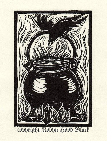
I carved the above relief print to accompany a poem I wrote for Jama Rattigan’s amazing blog, Alphabet Soup. I was honored to be one of her guest poets for April. The poem is called “Spooky Brew.”
My brother and I LOVED Halloween growing up. We turned our suburban home into a haunted house every year and the neighbor kids piled through. Our wonderful mom played right along – I think she enjoyed it as much as we did. (Thanks, Mom!)
I can remember drawing Halloween pictures as a kid – witches on brooms, black cats, jack-o-lanterns.

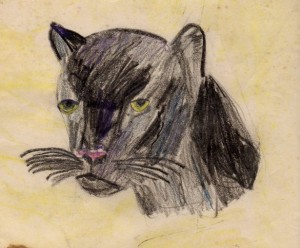
I’ve always had a thing for black cats. This one is actually a panther, I guess, but it was all I could find handily. I must have drawn it at about age 10 or 11.
These all had sharp edges and bold, jagged, pointy lines. Mwwahahahahahaha….
And somewhat related, a confession: my brother and I were afraid of a certain letter Y in the Encyclopedia Britannica. (Remember that, Mike?) I think the top of it was curved in some way. Whatever it looked like, it spooked us! That’s likely one reason I’m so crazy about lettering and fonts and such to this day. There is great power in a few strokes of black, a few marks on paper.
Whose spooky art do you admire? Edward Gorey?
Maybe some of Tomi Ungerer’s?
Share your thoughts below! (No tricks, now….)
Here are some more frightfully wonderful suggestions from your comments:
The terrifically talented Toni deTerlizzi
I’ll toss in another – the work of Mary GrandPré on the Harry Potter …more?


