Wishing you and yours more treats than tricks.
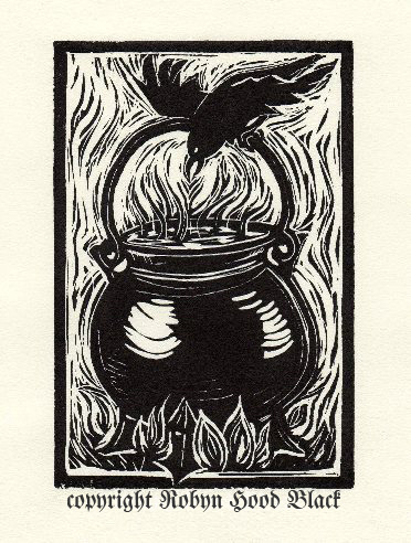
What makes certain images spooky? Subject matter, of course – but it’s also color, quality of line, and what the piece conjures up in the imagination.

I carved the above relief print to accompany a poem I wrote for Jama Rattigan’s amazing blog, Alphabet Soup. I was honored to be one of her guest poets for April. The poem is called “Spooky Brew.”
My brother and I LOVED Halloween growing up. We turned our suburban home into a haunted house every year and the neighbor kids piled through. Our wonderful mom played right along – I think she enjoyed it as much as we did. (Thanks, Mom!)
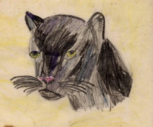
I can remember drawing Halloween pictures as a kid – witches on brooms, black cats, jack-o-lanterns.

I’ve always had a thing for black cats. This one is actually a panther, I guess, but it was all I could find handily. I must have drawn it at about age 10 or 11.
These all had sharp edges and bold, jagged, pointy lines. Mwwahahahahahaha….
And somewhat related, a confession: my brother and I were afraid of a certain letter Y in the Encyclopedia Britannica. (Remember that, Mike?) I think the top of it was curved in some way. Whatever it looked like, it spooked us! That’s likely one reason I’m so crazy about lettering and fonts and such to this day. There is great power in a few strokes of black, a few marks on paper.
Whose spooky art do you admire? Edward Gorey?
Maybe some of Tomi Ungerer’s?
Share your thoughts below! (No tricks, now….)
Here are some more frightfully wonderful suggestions from your comments:
The terrifically talented Toni deTerlizzi
I’ll toss in another – the work of Mary GrandPré on the Harry Potter …more?


I love that pot, Robyn! I think my favorite of your three is definitely Gorey. I love all that he presents, & keep finding some old books I didn’t know. Happy Halloween!
Thanks so much, Linda! I’ll keep having to dip into Edward Gorey today myself – at least while it’s daylight! ;0)
Edward Gorey’s art is deliciously dark and funny at the same time. It’s high time there was a retrospective of his work published. He, like Charles Adams, was a master of black humor.
However, my all-time favorite artist of fright is Bernie Wrightson. http://www.facebook.com/pages/Bernie-Wrightson/157503094275422
His illustrated version of FRANKENSTEIN is an absolute masterpiece!
Oooohh, thanks for that link, Scott. That is some deliciously scary stuff. And a Gorey restrospective would be great. Thanks for coming by!
Oh, there’s that cauldron relief print I love so much — and “Spooky Brew” is just the poem for today!
Interesting about both you and your brother being afraid of the letter Y. I always thought X was scarier.
I do like Gorey’s work, and more recently, Tony DiTerlizzi’s interpretation of “The Spider and the Fly.” Magnificence in black and white!
Happy Halloweeen, Jama! Thanks for visiting.
Tony DiTerlizzi – how could I forget Tony DiTerlizzi? Will add to the links above.
(X is a pretty scary letter – I don’t know exactly what it was about that particular Y. We were fine with other “Y”‘s – just not that one!)
There are some clever rhymes in your poem. I liked seeing your early artwork. Have a happy and safe Halloween, Robyn.
You too, Patricia! Thanks for stopping by.
Happy Halloween Robyn! This is a great post for today, thank you. I love the way you signed your cauldron print, perfect font. I must say Gorey is one of my all time favorites. I saw a show at the Orlando Museum of Art about him, it included some of his handwritten letters and decorated envelopes…a great exhibit.
Hi, Beth! Oh, I wish I’d seen that exhibit. Thanks for sharing. I took Seth to see the Norman Rockwell exhibit there a few years ago – fantatstic.
Happy Halloween!
Hi Robyn – Loved the reminiscing about the Haunted Houses! Remember the tunnel underneath my built in bed where we subjected our guests to “live burials”? As for the “scary Y” – I don’t think that letter scared you at all, I was the fraidy-cat. If you were scared at all it’s because I thought it was scary. Thanks for having my back! I think it was actually in the section for the letter “U” as in the Greek upsilon but with the tops hooked in rather than out, like it was going to grab and devour the reader. Some of the Russian letters are rather intimidating but not really scary; I admire some of them for doing the work of three or four Latin letters strung together (the “Kh” and “shch” in “Khrushchev” are each one letter, for instance!)
Believe it or not I’m a font geek too. Sometimes the name doesn’t really go with the font – you’d think “Akzidenz Grotesk” would be something menacing but it’s actually a pleasant and timeless sans-serif typeface family (almost 120 years old!) that was the inspiration for Helvetica (1957) and is the corporate font for McDonalds, Nissan USA, NBC Nightly News captions, and the American Red Cross, not to mention one of the three go-to fonts that every movie seems to use for its titles and posters along with Trajan (historical epics like “Troy” and “Titanic”) and Bank Gothic (sci-fi and action movies like “The Day After Tomorrow”).
Hey, Bro! Well, anyone reading your comment will know why YOU were the one who headed off the Vanderbilt at age 16. And why I could never win Trivial Pursuit… ;0) Thanks for all of this. A “U”, eh? See, my memory converted it to a “Y”. Love the backstory on the inspiration for Helvetica!