Art Break Wednesday: Gotta Love Gutenberg


Typography – ahhh, I even love the sound of the word, and the way it looks in print.  Last year I bought a couple-few books on type to add to my bookshelves and to my wee bit of knowledge about this fascinating subject.

Gutenberg to OPENTYPE cover 2013 05 29

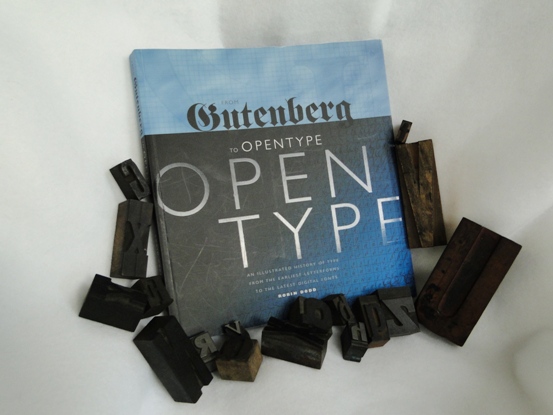
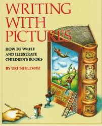
One I’m enjoying working my way through is From Gutenberg to OPENTYPE – An Illustrated History of Type from the Earliest Letterforms to the Latest Digital Fonts by Robin Dodd (Hartley & Marks, 2006).  The author is a London design consultant and lecturer specializing in design history and typographic theory.  Full of lively illustrations and examples, it’s an approachable, fun treatment of a big subject.

In researching a poem I’m working on, I found it necessary to revisit Mr. Gutenberg.

Johannes Gutenberg was born around or before 1400 in the German town of Mainz, where he died in 1468.  Between 1440 and 1450, he produced the first-known book printed from movable metal types.  Claims have been made that other inventors in other countries beat him to it, but it’s generally accepted that Gutenberg’s books were the first made this way.
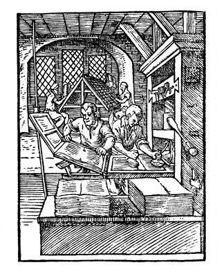
operating the printing press

Gutenberg’s achievement was to invent a system of mass production, enabling books to be produced in greater numbers and more economically,” Dodd writes.  “His invention played a fundamental role in the development of the modern world, and was the single most important factor in the spread of knowledge and the move toward universal literacy in the West.”

Gutenberg Bible Library of Congress

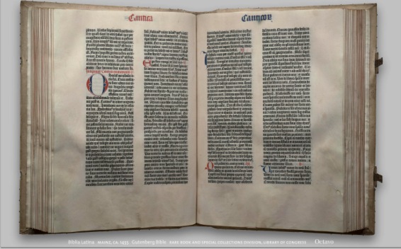
His masterpiece was his Bible (completed around 1455), in the Latin “Vulgate” translation, embodying two 42-line columns on each page.  Called The Mazarin Bible, its 1200-some pages were printed in two volumes. Dodd writes that about 180 copies were printed, and about 48 survive.

I didn’t realize that Gutenberg sought to imitate the handwritten nature of original manuscripts.

His typeface was based on Textura, the formal script of northern Germany,” Dodd writes.  “Research suggests that to imitate the inconsistencies and abbreviations that appear in a handwritten manuscript, Gutenberg must have cast at least 300 characters in order to provide slight variations of letterform throughout the text.”

Fascinating, no? And somehow it makes me admire the process all the more.

The Library of Congress website says of our special guest today: “Gutenberg’s invention of the mechanical printing press made it possible for the accumulated knowledge of the human race to become the common property of every person who knew how to read—an immense forward step in the emancipation of the human mind.”

As you go about your day and come across the printed word, give a little nod of thanks to our old friend Gutenberg.  It would be impossible to imagine our modern world without him.


Art Break Wednesday – Okay, This Post has My Kids in it…


Greetings!  I hope your May is blossoming with creative inspiration.  On the home front, we’ve been travelling  – to Beaufort, S. C. Beaufort was just voted the “happiest seaside town”  by Coastal Living Magazine.  Home to several thriving art galleries, it’s also on the list of Best 100 Art Towns in America.

Sibling Revelry - Seth and Morgan in Beaufort, SC.

Sibling Revelry – Seth and Morgan in Beaufort, SC.

Now that we’re back home, we’re gearing up for Seth’s graduation from high school this weekend.  For today’s “something to look at,” here’s a project he recently completed for his independent study art class this year.  It’s an etching, hand-colored with watercolor:

art © Seth Black

© 2013 Seth Black. All rights reserved. Etching with watercolor.

Morgan will be getting her hands messy this summer, too – fulfilling her art education requirements for her elementary education major.  She’s quite crafty, so I’ll be able to share something she whips up here soon I’m sure!

Wishing you creative inspiration wherever life finds you this May, and generous folks to share it with.


Art Break Wednesday: Uri Shulevitz’s WRITING WITH PICTURES

images WRITING WITH PICTURES cover

If I had to clear out my shelves and give up all but one book about illustrating children’s books, I’d keep Uri Shulevitz’s classic, WRITING WITH PICTURES – How to Write and Illustrate Children’s Books (Watson-Guptill Publications).  I have the bona fide 1985 version, which includes chapters on color separation – a process unknown to young illustrators today, I’m sure!

I revisited this wonderful volume this past week because I had to list a favorite quote for a blog interview appearing today at Check It Out.  I snuck in two quotes – one on haiku writing and one for art, the Uri Shulevitz quote I have literally written on my wall above my drawing table:

Give up the idea of the perfect flawless picture, and aim for one that is alive instead.

The book contains hundreds of examples of illustration that is alive, mostly Shulevitz’s own work but also work by other artists, including many classics.  Shulevitz won the Caldecott medal in 1969 for Arthur Ransome’s retelling of THE FOOL AND HIS FLYING SHIP and a Caldecott honor in 1980 for THE TREASURE.  Born in 1935 in Warsaw, the young Shulevitz and his family fled from Poland during World War II.  He lived in France and Israel before settling in New York to work and teach.

WRITING WITH PICTURES delves into what makes a story with a complete action as well as the finer points of drawing technique, style, and composition.  It includes the best examples I know about creating a storyboard and dummy.  For a taste, here is an excerpt from the book as tutorial on the site, Mighty Art Demos, which says the tutorial is reproduced with permission from the publisher.   While this is a pretty thorough excerpt, I’d still encourage anyone to purchase the book, chock-full of clear explanations and insights about the process from beginning to end.  Here are a few more quotes, to give you an idea:

A picture book is closer to theater and film, silent films in particular, than to other kinds of books.  It is a unique type of book.  (p. 16)

For a story to succeed, the reader must be engrossed in each successive moment of the story and must care about what happens next, or at least be curious enough to want to know. (p. 41)

Outstanding illustrations are effective on at least two levels.  First, they tell us the story, portraying the subject matter accurately; and second, the abstract pattern of the picture is alive in its own right, with an underlying geometric structure that gives character and strength to the forms. (p. 129)

Great stuff, no?  I have other books on illustration that I treasure, but this one captured me early on and still rings true.  Do you have any favorites?

Art Break Wednesday – Drawing, Writing, and Blind Contours


Want to strengthen your drawing AND maybe your writing, too?  Try blind contours!

Want to strengthen your drawing AND maybe your writing, too? Try blind contours!


A couple of weeks ago, poet, author and writing teacher Amy Ludwig VanDerwater kindly came by to share her “Drawing into Poems” project.  I’ve been thinking about connections between drawing (slowing down to notice details) and writing (sharing details through words).  So for my monthly poetry column today over at Janice Hardy’s The Other Side of the Story, I talk about all this, with a mini blind contour drawing session to boot.

If any of that sounds interesting to you, I invite you to click on over and share your thoughts!  Happy Creating.