Happy Wednesday!
Just a note that I’m travelling back from a family wedding, so a Wednesday post will more likely happen Thursday or so this week. ;0) Thanks for checking in.
Happy Creating,
Robyn
My wonderful friend and author Kim Siegelson left this intriguing note on my artsyletters Facebook page last month: “I found the coolest addition to your artsyletters set up today.” Curiousity was killing this cat! You see, in addition to sharing the writing life, Kim is the one I’ve turned to in past months for Etsy advice. She has a lively vintage Etsy shop (two actually), and I love seeing what new items show up in Perfect Patina. On my author blog in November, I shared another special gift she found for me and my appreciation for our vintage hunting adventures.
We finally met up at our SCBWI Southern Breeze Springmingle in Atlanta this past weekend, and Kim gave me my new surprise. (Drumroll….)
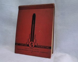 The Complete Second Edition of 20th Century Typewriting
by D. D. Lessenberry and E. A. Jevon, published by South-Western Publishing Company in 1933.
I love typewriting manuals! I have a couple others I’ve picked up in antique shops, but what makes this one stand out are the amazing illustrations of typewriters inside. (I couldn’t find a credit for these.) Here are some more samples:
Aren’t these great?
At art shows, one thing I’ve loved to offer is my old Underwood typewriter available for attendees to try out. Especially kids – most have never used one before! I make them type enough of a line to hear the magic bell…
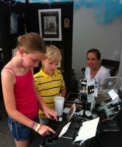
Jessica and Wyatt try out my old typewriter, as my daughter and “assistant shopkeeper” Morgan looks on.
One of the first products I wanted to offer in my new art business last fall was some typewriter notecards. 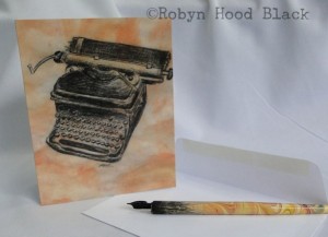
This image was drawn with pen and ink (and some colored pencil and other media worked in as well) on paper I had painted to suggest a parchment effect.
In the mixed media department, I was delighted to find on Etsy a dealer from Great Britain who had parts from an old Remington typewriter for sale. I’ve used these in a few pieces, and still have some left for future projects. This collage I made and sold on Etsy incorporated some of these metal parts, my own typewriter image above, a vintage flash card, some vintage metal letters, and a line of exercises from another old typewriting manual that reads:
“Write it on your heart that every day is the very best day in the year.”
I was delighted when a customer purchased this collage with the following note:
My husband is a “collector” of typewriters and we both love to live with our hearts so I cannot imagine anything much more appropriate for him than this framed piece.
Even more delighted when she kindly sent me a follow-up note as well:
Just wanted to tell you how much my husband LOVES the framed artwork and note cards. He opened it today and it is now placed happily on our piano. We can hardly believe how perfect the message and collage of unique items come together to match our lives.
Let me tell you, words like that fill my own heart and soul. I’ve been blessed to realize that beyond making items to sell, starting an art business has given me connections I treasure. These might be the happy thought that my work has made someone else smile, or the special knowledge that a friend would pick up a vintage typewriter manual with dynamic black illustrations of old typewriters, and she would think of me!
Thank you, Kim.
Anyone else have fond memories of clacking away on a heavy metal typewriter (or those sleek electric ones that slid into the market)? Do tell!
Somehow, Wednesday slipped right into Thursday over here. I’ll simply share a few items I’ve just listed in my Etsy shop. Here’s another literary red door, featuring an altered book from the 1800s and an original relief print, with vintage embellishments:
It has a couple of lines taken from Archibald MacLeish’s “Ars Poetica”:
Leaving, as the moon releases
Twig by twig the night-entangled trees,
…
A poem should not mean
But be.
Plus it has a cool illustration of an owl from an 1882 Reader.
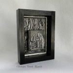
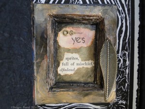
I’ve also had a Fey bent lately. Here are a couple of altered miniature books as Fairy Doors.
(Fairy, Faerie – whichever you prefer!)
They also feature vintage metal elements, repurposed text/ephemera, and hand-pulled original block prints.
Descriptions and more pictures of these are at my Etsy shop.
Here’s another Thursday update, a variation:
Thanks for taking a look!
(And, which DO you prefer – Fairy or Faerie?) ;0)
I spent much of the day at the home of lovely and talented artist Beth Rommel for our monthly art critique group meeting. Beth has been working hard behind the scenes on the 6 Degrees of Creativity “Pocket Change” project. Participants from all over the world have mailed in four Artist Trading Cards (ATCs) apiece. Each will receive three different ones back, with the fourth kept to be posted and shared with the others, online and possibly in an ezine.
The theme for this project was:
Pocket Change is all about how simple and small acts can create and instill kindness, gratitude, and change.
I sent in my cards and am looking forward to surprises in the mail later, plus seeing the whole group and learning how the creativity behind all of these cards – and there are hundreds and hundreds of cards – has enriched lives in small and large ways. Grateful to be participating!
This was my first foray into ATCs. I made mini mixed media collages using vintage materials and metal letterpress blocks as stamps. These four are the ones I contributed to the project. (The other two might end up in my Etsy shop.) :0)
I had a lot of fun making these, using materials such as a map from an 1875 geography book, an ad from a 1927 issue of Good Housekeeping, and bits and pieces of my own relief printing. Many thanks to the organizers for putting together this offering of creativity to the world!
On Saturday, I tooled up the road a couple of hours to Greenville, SC, for the first-ever Makers Summit sponsored by Indie Craft Parade, held at a great elegant/industrial meeting space called Zen. It was a day full of sessions and networking for artist-business owners.
Greenville is a special town to me, as my husband and I met at Furman University there and married a couple of weeks after graduation. Our daughter is a student there now! But back in the day, downtown was not exactly the destination spot it is today, with so many vibrant shops, restaurants, and a glorious park at the falls. It’s the perfect location for a workshop such as the Makers Summit.
As you can imagine, it was a talented group of attendees enjoying some very savvy, talented speakers. In fact, a little Googling online will take you to some professionally shot photos of the day by several who were there. But maybe these pictures from my phone will whet your appetite to sign up when they do it again!
Speakers included Stephen Fraser from Spoonflower, Grace Kang of Retail Recipes, designer Justin Gammon, author Amy Flurry, artist-entrepreneur and author Barb Blair of Knack Studios, Mail Chimp’s Amy Ellis, and Etsy’s own Kimm Alfonso, with a few other experts on hand to offer additional business advice. Topics in the general sessions included branding and product lines, online selling, and expanding markets.
One of the perks of the day was meeting fellow artists and craftspeople making a business out of their creative passions. I had connected, through an Etsy blog, with Karen Sims Deady before the big day.
It was fun to meet her in person and chat between sessions. She has a gorgeous Etsy shop, KSDLuxe, with contemporary artisan jewelry. She’s also from Georgia, not terribly far from my neck of the woods.
I also had a 10-minute review of my Etsy shop with Etsy Support representative Nicole Bogatitus. It was helpful to have professional feedback, since running an indie art business is at times like navigating without a map. (And I found her comments encouraging for my first few months out in the big online world!)
Gatherings like this definitely help artist-entrepreneurs along the way, however. Navigating by the stars is more adventuresome anyway, don’t you think?
Oh – and there were goodie bags to swoon for. Just look at all this fun stuff:
When I finish playing with it all, I have to get back to business – the business of selling my art! I’m thankful to have some new strategies to ponder and new peers to keep up with.
I’ll definitely sign up for the Makers Summit when it comes around again. My guess is, we should all sign up early.
One of those milestone ones. Others in my family are having them, too: my daughter turned 21 this month, and my son will turn 18 this spring. (Last year, my hubby got a head start on the milestone I’m hitting today.)
This past year has been particularly full of struggles and joys, losses and new adventures. Maybe that’s the reason for my current obsession: doors. The poet in me is all about the metaphor, for myself and for each person in my family. Doors closing (some slamming painfully shut; others slowly creaking closed until you realize you’re in a different place) and others opening (new experiences and things to learn, new art to make, new poems to write, new endeavors to launch, new friends to meet…).
The artist in me is all about a visual description of that metaphor – books as doors! What better than a book to transport us to new worlds, open up new ways of thinking and dreaming and wondering?
Hence, my newest artistic adventures. Vintage books-as-doors collages! (With poetry inside, too.)
For this piece, I hollowed out a vintage book, embellished it, and tucked in this Emily Dickinson poem from another vintage book:
***
Precious Words
He ate and drank the precious words
His spirit grew robust;
He knew no more that he was poor,
Nor that his frame was dust.
He danced along the dingy days,
And this bequest of wings
Was but a book. What liberty
A loosened spirit brings!
***
The door is adorned with a round filigree find from an antique shop, and a vintage jewelry part I bought from a European dealer on Etsy. The door knocker (also purchased on Etsy) is a vintage brass doll house door knocker. I’m stashing all kinds of fun vintage bits of hardware for these.
Surrounding the door, with sidelights and a fanlight, is relief print I carved. It’s a simplified version of a doorway in Dublin, the kind I got to see in person when my father-in-law took our whole family to Ireland when our kids were little bitty.
This collage is 9 X 12, in a cradled wood panel painted glossy black. I’m excited about making these collages in different sizes and with different details. When I took this to show my art critique group this month, seeking their feedback, one of the members bought it! That was pretty encouraging feedback.
(More coming soon for sale in my Etsy shop! I’m making them now. Really – working on them right now!)
Do you remember any particular doors from your past? I remember the wrought iron gates to the small courtyard in the house I grew up in in Florida. I remember walking through the gi-normous jaws of an alligator to enter Gatorland there, too. And the imposing entrance to the Haunted Mansion at Disney World! How about you? How about now?
Perhaps you’re facing big transitions soon – as we’ll be adjusting to our youngest leaving the nest over here. Or perhaps your journey will be less jarring. Whatever doors you walk through this year, I wish you blessings as you come and go, and joy and adventure on the other side.
Last week I mentioned a few fun creative swaps I’ve been participating in. One of those was a poetry swap, and I was lucky to have its organizer, Tabatha Yeatts, as my swap partner. (Here’s my post about it on my author blog.)
In addition to a wonderful poem, Tabatha sent me some fine hand-crafted teas (from an Etsy vendor!) and – be still my heart – a lovely old book.
ENGLISH BOOK ILLUSTRATION 1800-1900 by Philip James is a delightful, slim volume chock-full of creative greats of the 19th century. The book was published in 1947 by The KING PENGUIN Books (London and New York.) You’ll likely see it here again, because there’s too much goodness in it to share in one post.
Tabatha couldn’t have bestowed this gift on a more appreciative recipient – I’m lapping it up like a kitten at a saucer of milk. On my only trip (thus far!) to New York, while my daughter and friends went to the top of the Rockefeller, I snuck away to the (Pierpont) Morgan Library & Museum (okay, that’s another post, too, because a talented young architect who is the niece of my good friend Peggy was involved in its recent renovation). The point of this side journey here is just to mention that I spent all of my souvenir money on one thing – a delicious hardback book documenting an exhibit they’d hosted previously. BE MERRY AND WISE, Origins of Children’s Book Publishing in England, 1650-1850 by Brian Alderson and Felix de Marez Oyens is huge, heavy, and brimming with history and exquisite illustrations. I left the $115 price tag on its back.
So I am a very grateful nerd to have Tabatha’s gift to add to my shelf, which also includes such nerdy titles as A HISTORY OF THE BOOK IN AMERICA (Amory and Hall, eds.), THE NORTON ANTHOLOGY OF CHILDREN’S LITERATURE (2005), THROUGH THE EYES OF A CHILD (by Donna Norton, 1983, bought when I was in college or thereabouts and just because I wanted it), and THE ARBUTHNOT ANTHOLOGY OF CHILDREN’S LITERATURE (late 1950s?), which I’ve had on extended loan from my mother-in-law, and several volumes about reading and writing in 17th Century America.
ENGLISH BOOK ILLUSTRATION 1800-1900 features many representative black and white illustrations as well as color plates in the back. These include woodcuts, wood engravings, copper-plate etchings and engravings, aquatints, mezzotints and hand-colored lithographs. The century opens with Thomas Bewick and William Blake and moves on to the work of Constable, Turner, Cruikshank, Crane, Carroll, Tenniel, Whistler, Beardsley, Caldecott, and Greenaway, just to name a few!
I am enjoying gems of commentary, such as:
Illustration is like décor in the ballet, one of several arts planned by a team of artists. Dance, drama, music and design together make a spectacle in which each has its share. Similarly, type, paper, binding and illustrations must all contribute to the art of the book. (p. 8)
Looking at illustration against the backdrop of a swiftly changing world, James writes:
With the surge of industrial development that followed the railways, sheer stark ugliness prevailed everywhere, but at all times there were book artists who displayed a widely varying mixture of these three typical characteristics, the love of Nature, a literary bias and the romantic temper; and in so doing they maintained the English tradition. (p. 13)
He lauds Bewick:
Bewick was the first British wood-engraver to earn and deserve a continental reputation. … Chief among his innovations was a new conception of the black and white picture. He did not think of it as a white space on which black outlines and solids made a linear design printed in relief, the background having been cut away to a lower level, as in the woodcuts of the fifteenth and sixteenth centuries… . Instead he began with a black void out of whch the subject appears in a varying range of grey tones with pure white for the lightest parts. (p.18)
And, in describing a particular image on the second plate in the back, James presents painter J. M. W. Turner’s contributions to illustration in these words:
They almost seem to have been breathed on the page; each subject melts away in an airy perspective on the dead white surface of the paper. (p. 26)
Isn’t that poetic?
Finally, a sentence that seems as applicable today as it was 60-plus years ago:
But in time every new technique is assimilated by the artist and the fluctuating struggle between the crafts and the machine becomes not a battle for extinction but a source of vitality. (p. 14)
I hope so. I’ll never lose my bias, however, for a good old-fashioned, deckled-edge, well-crafted book!
Thanks for taking this detour back with me – there will be more, I’m sure. Do you have a favorite artist from the past who inspires you today?
I’m so excited! I just signed up to attend “The Maker’s Summit,” an all-day business conference on Feb. 2, 2013 for creatives, sponsored by Indie Craft Parade in Greenville, SC. (The Indie Craft Parade takes place in September.) Speakers include Stephen Fraser (founder, Spoonflower), Grace Kang (founder, Pink Olive and RetailRecipes.com) and Kimm Alfonso (Etsy, community outreach).
It’s only a couple hours away from my home in Georgia, so within striking distance, even during a busy weekend on my end. My husband and I met at/graduated from Furman University in Greenville a few moons ago, and our daughter is there now. Back in the day, downtown was not really any kind of destination spot! I loved the art museum, but the rest in my memory was just kind of industrial terrain to stay away from.
Now the city is a vibrant tourist destination, with a gorgeous park at the waterfall, many fine restaurants and unique boutiques, horse-drawn carriages, art galleries, and character galore. We love going up there!
I look forward to connecting with other artists and creative indie business owners. In fact, I stumbled upon a comment on an Etsy blog about this conference from an Etsy shop owner who lives in the Atlanta area. So we’ve already exchanged cell phone numbers and plan to meet up. :0)
It this conference is calling you, too, click on the logo above to learn more. Happy Creating!
Any card!
Okay, not THAT kind of card.
This week I signed on to participate in an exchange of Artists Trading Cards (ATCs). The deadline was last night and I think I squealed in just before cut-off.
I’ve seen them around and in the art magazines for a long time – these amazing little gems of art shared between creators and often sent to other parts of the country or world. They’re about the size of playing cards, or sports trading cards, etc., and just about anything goes media-wise.
My amazingly generous and talented friend Beth Rommel has volunteered to help with this current project, which she blogged about here and here. (Click over to see some lovely examples of her ATC’s.) It’s fun to think of these colorful wonders not only arriving in someone’s mailbox, but perhaps left somewhere to brighten a stranger’s day, guerilla-style!
You might see the acronym ACEO as well – this stands for “Art Cards, Editions, and Originals.” Artists often sell these at shows and online. (On Etsy, for instance! A search of ACEO, or ATC, will yield thousands upon thousands of results.)
One reason I jumped in for this project is that I’ve recently enjoyed receiving creative surprises in the mail. I had the good fortune to participate in a Poetry Swap in December, organized by the also-generous-and-talented Tabatha Yeatts. My blog post about her gift to me is here. And her post about my gift to her is here.
Another poetry friend Laura Shovan is blogging about a postcard project she’s got going on this month and next, celebrating her 44th birthday in February. (She’s documenting these one by one in current posts!) I recently received my postcard (with an original poem of hers on the back) and blogged about it, too, here.
I look forward to creating my own Artist Trading Cards in the next couple of weeks and sending them off. I’ll post a picture or two.
How about you? Have you participated in any fun, creative swaps yielding a bit of wonder in your mailbox?