Art Break Wednesday: Art in the Square around the Corner!

0013Main_2013 Poster .indd

Greetings from the road!  No real post today, but here’s a poster.

I’m looking forward to participating in Art in the Square in Gainesville, Georgia, Sat. & Sun., Sept. 21-22.  This was my first art show for artsyletters last year!

If you’re in the area and out and about that weekend, come on by.  Many wonderful artists will be displaying and selling work, and other treats will abound.  For more info, please click here.

Hope to see you there!

Art Break Wednesday – Just My (Wooden) Type!


I love vintage wooden printing type.  The chunky solidness of each letter, the way a block feels in your hand, the patina of oh-so-smooth wood, ink long since seeped into its grain… ahhh.

S wooden letterpress blocks

My own collection began with a jackpot.  Rummaging in a local antique store early last year, I found a beautiful old printer’s tray and asked the proprietor if she had any typewriter keys.  No, she replied, but did you see the wooden type?  She took me to the back, back room (where I didn’t confess I’d already done some pretty thorough snooping).  Under a stack of boxes, she unearthed a few black plastic musty dusty trays, encrusted in years of delightful neglect. They were full of large wooden letterpress letters! “How much for all of them?” I asked.

“As you see, no one has touched them for a long time.  How about $20?”

I couldn’t believe my luck.  (And I’ve since discovered that letters like these easily command $5 or more apiece.)

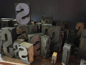
They came home with me and mostly stayed in their trays for months, until not long ago I asked myself why I was keeping them hidden, when I’d love to look at them every day?  So my poetry books got moved from their narrow little bookshelf to a bigger bookshelf (their numbers had outgrown the small shelves anyway), and the vintage wooden shelf got moved into my office/studio, just behind the big old desk where I make most of my artwork. wooden letterpress bookshelf I enjoy the letters every day now, and I have easy access to them for projects.


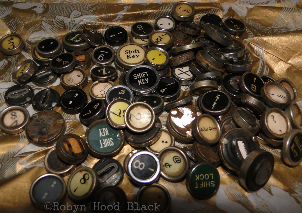
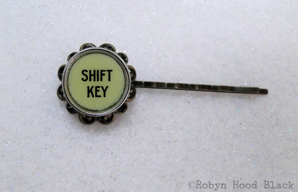
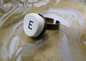
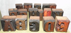
I always keep an eye out for letterpress type when I’m antiquing.  (I have a good little collection of metal type, too.)  I’ve picked up some treasures, but I’ve also discovered that some letters are extremely hard to come by.  I didn’t have a single C or E, for instance. So I went on an Etsy hunt to splurge on a complete set if I could find one.


I fell into a shop based in India, Vintage Marvels.

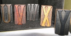
Oh, my.  The hand-carved letters are beautiful and have a bit of an exotic flair compared to the standard fonts already gracing my shelves.  wooden letterpress 3
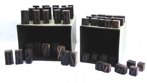
With a specific project in mind in which I’ll hand-stamp their impressions (you’ll see soon – promise), I purchased TWO sets.  I just couldn’t decide, and I wanted the two different sizes.  The larger blocks are about two inches tall, and the smaller ones about an inch.

letterpress blocks 5

letterpress blocks 6

Call me obsessed, or a nerd, I don’t mind.  There’s something magical to me about the rich, dark lure of vintage letterpress.  And I’m sure the feel of the blocks harkens back to endless hours of playing with toy blocks that the lucky among us remember.  You could make words, villages, towers… whole worlds out of little wooden blocks.

Now I get to tap into this world of imagination and endless potential as a grown-up, too.

THANKS with watermark crop for blog

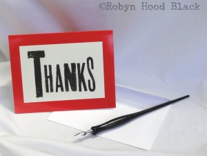
These letterpress-inspired cards offer a bold way to say Thank You! The original image was hand-stamped with vintage blocks. Click here for my Etsy shop listing – a pack of 8 cards/envelopes is $7.50 + shipping. :0)

Do you have some treasures that bring you joy tucked away somewhere?  Life is short – make them a part of your daily experience!


Art Break Wednesday: Decatur Book Festival, Here I Come!


BOOKZILLA interpreted by Dan Santat

BOOKZILLA interpreted by Dan Santat

July already!  I hope you and yours are enjoying a happy week celebrating Independence Day.  Today I’m directing you to all the info recently posted about the upcoming Decatur Book Festival – Aug. 30 – Sept. 1 on the beautiful Decatur Square in Atlanta.

I’ve participated in the festival in past years as an author, and even enjoyed a stint on the children’s stage in 2009 (following Jon Scieszka.  Really.)  This year, I’m thrilled that I’ll be one of the vendors among all those cool booths brimming with goodies for book lovers.  I’ll have my “literary art with a vintage vibe:” – mixed media pieces, relief prints and drawings, note cards, book marks, hand-stamped letterpress initials, and more.  I’ll have some books for sale as well. Please come by! (Thanks to Square, I’m happy to take credit card payments as well as cash.)

Fellow art critique group member and amazing artist Leighanne Schneider has participated as a vendor for several years.  I signed up before I knew this, but now I’m looking forward to hanging out with her all weekend, too.

Those dates again for this LARGEST INDEPENDENT BOOK FESTIVAL in the nation?  LABOR DAY WEEKEND – August 30 – Sept. 1, 2013.  See you there!

Art Break Wednesday: Blown Away by a Book Cover


It’s my privilege to write a monthly poetry column over at my friend Janice Hardy’s terrific blog for fiction writers, THE OTHER SIDE OF THE STORY.  My offering over there today harkens back to Notan (positive/negative shapes and such) as a simple way to think about characters in a story.  As an example, I borrowed characters from Margarita Engle’s wonderful book, Hurricane Dancers (Henry Holt and Company, 2011).

hurricane dancers cover

jacket illustration ©Cathie Bleck

I think its cover is, like the writing, just exquisite.  The jacket illustration was done by Cathie Bleck.  (The Artist’s Statement on her website sings to me!)  The jacket designers were Rich Deas and Elizabeth Tardiff.

The book has six parts, each comprised of individual poems told in five voices. I love the visual opening each of these as well:

Wild Sea interior hurricane dancers

I don’t know what the lettering/font is called, but I’m also in love with the letters.  Looks to me like blackletter with curlicues and a Western twang (with the “points” peeking out along the stems of the letters.)  Very dynamic.

For a treat, click here to see a video of cover artist Cathie Bleck’s artistic process using kaolin clay.  Many of her incredible paintings as well as some studies and sketchbooks are posted on her site as well.  Enjoy!


Art Break Wednesday: Gotta Love Gutenberg


Typography – ahhh, I even love the sound of the word, and the way it looks in print.  Last year I bought a couple-few books on type to add to my bookshelves and to my wee bit of knowledge about this fascinating subject.

Gutenberg to OPENTYPE cover 2013 05 29

One I’m enjoying working my way through is From Gutenberg to OPENTYPE – An Illustrated History of Type from the Earliest Letterforms to the Latest Digital Fonts by Robin Dodd (Hartley & Marks, 2006).  The author is a London design consultant and lecturer specializing in design history and typographic theory.  Full of lively illustrations and examples, it’s an approachable, fun treatment of a big subject.

In researching a poem I’m working on, I found it necessary to revisit Mr. Gutenberg.

Johannes Gutenberg was born around or before 1400 in the German town of Mainz, where he died in 1468.  Between 1440 and 1450, he produced the first-known book printed from movable metal types.  Claims have been made that other inventors in other countries beat him to it, but it’s generally accepted that Gutenberg’s books were the first made this way.

operating the printing press

Gutenberg’s achievement was to invent a system of mass production, enabling books to be produced in greater numbers and more economically,” Dodd writes.  “His invention played a fundamental role in the development of the modern world, and was the single most important factor in the spread of knowledge and the move toward universal literacy in the West.”

Gutenberg Bible Library of Congress

His masterpiece was his Bible (completed around 1455), in the Latin “Vulgate” translation, embodying two 42-line columns on each page.  Called The Mazarin Bible, its 1200-some pages were printed in two volumes. Dodd writes that about 180 copies were printed, and about 48 survive.

I didn’t realize that Gutenberg sought to imitate the handwritten nature of original manuscripts.

His typeface was based on Textura, the formal script of northern Germany,” Dodd writes.  “Research suggests that to imitate the inconsistencies and abbreviations that appear in a handwritten manuscript, Gutenberg must have cast at least 300 characters in order to provide slight variations of letterform throughout the text.”

Fascinating, no? And somehow it makes me admire the process all the more.

The Library of Congress website says of our special guest today: “Gutenberg’s invention of the mechanical printing press made it possible for the accumulated knowledge of the human race to become the common property of every person who knew how to read—an immense forward step in the emancipation of the human mind.”

As you go about your day and come across the printed word, give a little nod of thanks to our old friend Gutenberg.  It would be impossible to imagine our modern world without him.


Art Break Wednesday – Okay, This Post has My Kids in it…


Greetings!  I hope your May is blossoming with creative inspiration.  On the home front, we’ve been travelling  – to Beaufort, S. C. Beaufort was just voted the “happiest seaside town”  by Coastal Living Magazine.  Home to several thriving art galleries, it’s also on the list of Best 100 Art Towns in America.

Sibling Revelry - Seth and Morgan in Beaufort, SC.

Sibling Revelry – Seth and Morgan in Beaufort, SC.

Now that we’re back home, we’re gearing up for Seth’s graduation from high school this weekend.  For today’s “something to look at,” here’s a project he recently completed for his independent study art class this year.  It’s an etching, hand-colored with watercolor:

art © Seth Black

© 2013 Seth Black. All rights reserved. Etching with watercolor.

Morgan will be getting her hands messy this summer, too – fulfilling her art education requirements for her elementary education major.  She’s quite crafty, so I’ll be able to share something she whips up here soon I’m sure!

Wishing you creative inspiration wherever life finds you this May, and generous folks to share it with.


Art Break Wednesday – Drawing, Writing, and Blind Contours


Want to strengthen your drawing AND maybe your writing, too?  Try blind contours!

Want to strengthen your drawing AND maybe your writing, too? Try blind contours!


A couple of weeks ago, poet, author and writing teacher Amy Ludwig VanDerwater kindly came by to share her “Drawing into Poems” project.  I’ve been thinking about connections between drawing (slowing down to notice details) and writing (sharing details through words).  So for my monthly poetry column today over at Janice Hardy’s The Other Side of the Story, I talk about all this, with a mini blind contour drawing session to boot.

If any of that sounds interesting to you, I invite you to click on over and share your thoughts!  Happy Creating.

Art Break Wednesday: Terrific Art Springing up – Check Out these Artists!


Greetings, Art Friends!

On the home front, I’m zipping between region and state tennis tournaments this week for my youngest, a high school senior and captain of the team. DSC_0036 seth with trophy small  (Blog posts I’ve been planning in my head have yet to materialize, in other words!)

But it’s still Wednesday, so I’d love to share a few links which are sure to delight your eyes.  Click around and enjoy!

First up is Chip Ghignachip ghigna art cropChip is the son of noted children’s poet Charles Ghigna, aka Father Goose.  I’ve been eyeing Chip’s colorful, lively paintings on the Father Goose blog for a while now.


Chip is a recent graduate of Auburn University and currently enjoying his first gallery show at the Ellenburg Gallery at the Homewood Public Library, next door in Alabama.  If you’re in that neighborhood, check it out!  If not, please enjoy clicking and scrolling online.


Next, you’ll enjoy tooling around the portfolios of Joseph Bradley.  I met Joseph briefly at The Maker’s Summit in Greenville, South Carolina, in February.  joseph bradley art cropHe hails from a neighboring town, Pendleton, and I quickly assessed that his paintings on wood panels have more than a few fans.  Take a look-see and you’ll learn why!  Joseph has just added many new pieces.

Last but not least on our mini gallery tour today is the newest member of my wonderful art critique group, fellow Georgian and the creative force behind Doublefly Design, Leighanne Schneider . leighanne art crop Here’s a link to her fine art site, and she has a treasure trunk full of irresistible offerings at her illustration site.  She doesn’t know this yet – nor do my other art critique group partners in crime – but I do plan to feature each one of them in a proper interview post in coming months.  Forgiveness is easier to get than permission, you know…

Here’s hoping you are surrounded by colorful April flowers – and art! – springing up, and that the pollen is passing you by.  Enjoy creating, and support your friendly local artists. :0)

Thanks for visiting.