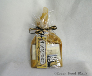
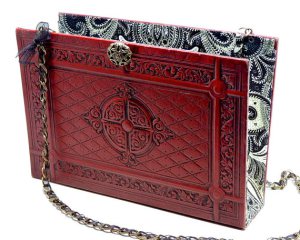
Art Break Wednesday is taking a mini summer break this week. I hope you are having a terrific, creative, sun-shiny summer, and I’ll see you here next week!
Robyn
July already! I hope you and yours are enjoying a happy week celebrating Independence Day. Today I’m directing you to all the info recently posted about the upcoming Decatur Book Festival – Aug. 30 – Sept. 1 on the beautiful Decatur Square in Atlanta.
I’ve participated in the festival in past years as an author, and even enjoyed a stint on the children’s stage in 2009 (following Jon Scieszka. Really.) This year, I’m thrilled that I’ll be one of the vendors among all those cool booths brimming with goodies for book lovers. I’ll have my “literary art with a vintage vibe:” – mixed media pieces, relief prints and drawings, note cards, book marks, hand-stamped letterpress initials, and more. I’ll have some books for sale as well. Please come by! (Thanks to Square, I’m happy to take credit card payments as well as cash.)
Fellow art critique group member and amazing artist Leighanne Schneider has participated as a vendor for several years. I signed up before I knew this, but now I’m looking forward to hanging out with her all weekend, too.
Those dates again for this LARGEST INDEPENDENT BOOK FESTIVAL in the nation? LABOR DAY WEEKEND – August 30 – Sept. 1, 2013. See you there!
(Sorry for the day’s delay – summertime, you know….)
What if classic authors had used social media? I’ve had some fun with this idea creating the start to a series of new works using vintage “Authors” playing cards.
For instance, perhaps the Bard, while penning Romeo and Juliet, would have dubbed himself @mymindmisgives and sent a little message to @dearestjuliet – “Stony limits cannot hold love out” – with the hashtag #hanginginthestars.
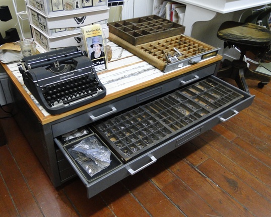
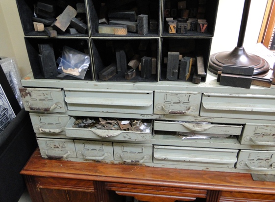
Okay, I’ve been having fun playing with vintage metal letterpress type, too.
I’m making 8 X 8 shadow box frame versions like the one above, and, in a smaller image at a smaller price point, a matted 8 X 8 option with mini-versions of these vintage cards. Like this:
Here we have Charles Dickens, in the midst of David Copperfield. Hence the reference to himself as @trueastaxes, the quote, “Trifles make the sum of life,” and the hashtag #umblepie. (That’s bona fide “umble,” not “humble.”)
You get the idea. In my Etsy shop I’ve got a couple of the framed versions and three of the matted pieces. I’ll add more as I make them and want to have a nice selection of these (and lots of literary art) for my booth the 2013 Decatur Book Festival coming up Labor Day Weekend.
For these “hashtag classic authors,” I’m only using phrases lifted from their direct quotations and works. I hope they would get a kick out of them if they time-travelled to our fast-paced, social-media-driven lives. To see this section in my Etsy shop, click here. Enjoy, and thanks for visiting!
Nice surprise in the mail this week: I’m the proud owner of a new trademark!
A business name does not have to be registered as a trademark, of course. But I wanted to give it a try. My experience was fairly fast and painless as these things go.
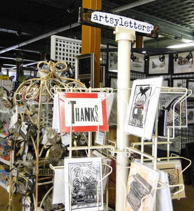
When contemplating starting an art business and Etsy shop last spring, I came up with lots of brilliant business names. Only to find online that other folks had come up with said brilliant names long before I. When “artsyletters” meandered into my mind, I was happy to discover I couldn’t find it online. First stop: website domain. Then I opened an Etsy shop with the name, though I wouldn’t add any items to it for a few more months. I got a Facebook page, Twitter account and Pinterest account using it. (Plus a few other social media outlets that I haven’t really set up yet.)
It’s somewhat easier/cheaper to get a trademark if the name is already in use by you in commerce. So I made some sales starting in late summer last year, stocking my Etsy shop and hitting some art shows in the fall. I put my name/logo on all my products and had a banner made for my show tent. Now I was ready to apply for a trademark. Watching the budget, I opted for LegalZoom.
My eyes tend to glaze over with legal-ese, but I was (pretty much) able to figure out the forms. When I had questions, the LegalZoom folks responded in emails or when I called. I decided to apply in an already existing category (International Class 16) that most closely matched what I’m producing, even though I don’t make all of the items in that class (um, pressed flowers?).
They conducted an initial search. This search brings up names of businesses which might cause confusion for consumers, and therefore might keep you from being able to trademark your chosen name. After these results, I opted to upgrade my membership so I could speak with an attorney by phone for 30 minutes before sallying forth. (You can upgrade without any kind of lengthy contract – in my case I did for the first couple-few months of the process so I’d have access to an attorney appointment at a very reduced rate.)
The person I spoke with was very clear, professional, and friendly. He pointed out one other existing business name which might give the USPTO pause when considering mine, because the category of products was similar. He said he thought I had at least a 50/50 chance of getting through the first time, though. With those precarious odds and crossed fingers, I decided to proceed. I filed in October, I believe.
To my delight, my business name was published in the USPTO Trademark Official Gazette in March after its initial review. This means it was “published for opposition.” Well, let me let the USPTO explain it:
If the examining attorney raises no objections to registration, or if the
applicant overcomes all objections, the examining attorney will approve the mark
for publication in the Official Gazette, a weekly publication of the
USPTO. The USPTO will send a notice of publication to the applicant stating the
date of publication. After the mark is published in the Official
Gazette, any party who believes it may be damaged by registration of the
mark has thirty (30) days from the publication date to file either an opposition
to registration or a request to extend the time to oppose.
I never discovered any objections, and I got the lovely certificate above in the mail this week. The entire process can take from six months to a year, and in some cases, longer. I was happy to enjoy pretty smooth sailing for mine. The whole process cost me somewhere in the neighborhood of $500, with the very modestly priced phone consultation tacked onto the registration fees.
If you decide to pursue it for your business, be prepared for some other interesting mail to come your way. I’ve had several letters from entities whose return addresses are countries in Eastern Europe, claiming to offer international “filing” or “registration” of my US trademark, all for say, a few thousand dollars. I love the fine-print disclaimer that came in one yesterday: “...please notice that this registration has not any connection with the publication of official registrations, and is not a registration by a government organization….” – yet the “fee” was $2327.00. (!)
Please also note that this little ramble in absolutely no way whatsoever constitutes any sort of legal advice, which I am unabashedly unqualified to dole out. (Also, no animals were harmed in the composition of this blog post.) But I wanted to share this little piece of my journey for other indie artists/interested folks out there. Thanks for coming along!
Today I have a special treat – for me and for you!
First, I get to meet my friend Ann Goble for lunch. We try to do this every once in a while – not nearly enough! Ann has been a dear friend for many years, as we’ve both raised our kids and pursued creative careers as well. Our sons just graduated, but I know our friendship will long continue.
Now the treat for you – I thought I’d share a bit of Ann’s work here to brighten your day. I’ll have her back for a real interview soon, but I wanted to whet your appetite.
Ann began seriously painting in1999. She has studied under renowned painters including Roseta Santiago, David Leffel, Gregg Kreutz and Marc Chatov. Her work has garnered numerous awards and hangs in galleries and private collections.
Her paintings are breathtaking. Here are some of my favorites:
Ann begins her artist’s statement, “Painting is for me a search for beauty.” I think you’ll agree she’s found it! You can learn more about Ann and see additional paintings here.
But wait – there’s more! Ann’s mother, Ruth I. Money, is also an accomplished painter. (You know, the apple doesn’t fall…) Ruth and Ann have exhibited their paintings in the same shows before, and if you happen to live in north Georgia, you can see an exhibit celebrating both their careers. “Mothers and Daughters” runs until July 19 at The Bowen Center for the Arts. Click here for more info, directions, and images of paintings – and feel free to leave some love in the comments below.
It’s my privilege to write a monthly poetry column over at my friend Janice Hardy’s terrific blog for fiction writers, THE OTHER SIDE OF THE STORY. My offering over there today harkens back to Notan (positive/negative shapes and such) as a simple way to think about characters in a story. As an example, I borrowed characters from Margarita Engle’s wonderful book, Hurricane Dancers (Henry Holt and Company, 2011).
I think its cover is, like the writing, just exquisite. The jacket illustration was done by Cathie Bleck. (The Artist’s Statement on her website sings to me!) The jacket designers were Rich Deas and Elizabeth Tardiff.
The book has six parts, each comprised of individual poems told in five voices. I love the visual opening each of these as well:
I don’t know what the lettering/font is called, but I’m also in love with the letters. Looks to me like blackletter with curlicues and a Western twang (with the “points” peeking out along the stems of the letters.) Very dynamic.
For a treat, click here to see a video of cover artist Cathie Bleck’s artistic process using kaolin clay. Many of her incredible paintings as well as some studies and sketchbooks are posted on her site as well. Enjoy!
Typography – ahhh, I even love the sound of the word, and the way it looks in print. Last year I bought a couple-few books on type to add to my bookshelves and to my wee bit of knowledge about this fascinating subject.
One I’m enjoying working my way through is From Gutenberg to OPENTYPE – An Illustrated History of Type from the Earliest Letterforms to the Latest Digital Fonts by Robin Dodd (Hartley & Marks, 2006). The author is a London design consultant and lecturer specializing in design history and typographic theory. Full of lively illustrations and examples, it’s an approachable, fun treatment of a big subject.
In researching a poem I’m working on, I found it necessary to revisit Mr. Gutenberg.
Johannes Gutenberg was born around or before 1400 in the German town of Mainz, where he died in 1468. Between 1440 and 1450, he produced the first-known book printed from movable metal types. Claims have been made that other inventors in other countries beat him to it, but it’s generally accepted that Gutenberg’s books were the first made this way.
“Gutenberg’s achievement was to invent a system of mass production, enabling books to be produced in greater numbers and more economically,” Dodd writes. “His invention played a fundamental role in the development of the modern world, and was the single most important factor in the spread of knowledge and the move toward universal literacy in the West.”
His masterpiece was his Bible (completed around 1455), in the Latin “Vulgate” translation, embodying two 42-line columns on each page. Called The Mazarin Bible, its 1200-some pages were printed in two volumes. Dodd writes that about 180 copies were printed, and about 48 survive.
I didn’t realize that Gutenberg sought to imitate the handwritten nature of original manuscripts.
“His typeface was based on Textura, the formal script of northern Germany,” Dodd writes. “Research suggests that to imitate the inconsistencies and abbreviations that appear in a handwritten manuscript, Gutenberg must have cast at least 300 characters in order to provide slight variations of letterform throughout the text.”
Fascinating, no? And somehow it makes me admire the process all the more.
The Library of Congress website says of our special guest today: “Gutenberg’s invention of the mechanical printing press made it possible for the accumulated knowledge of the human race to become the common property of every person who knew how to read—an immense forward step in the emancipation of the human mind.”
As you go about your day and come across the printed word, give a little nod of thanks to our old friend Gutenberg. It would be impossible to imagine our modern world without him.
Somewhere between my youngest’s graduation over the weekend, out of town company, and a visit to the oral surgeon for said graduate with a newly scheduled wisdom tooth removal for Wed. morning, I didn’t quite scare up a post. Thanks to anyone for checking in, and I’ll be back next week!
Happy creating.
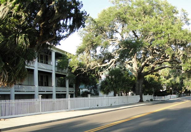
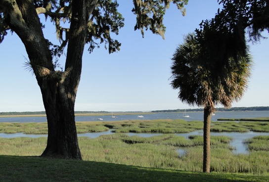
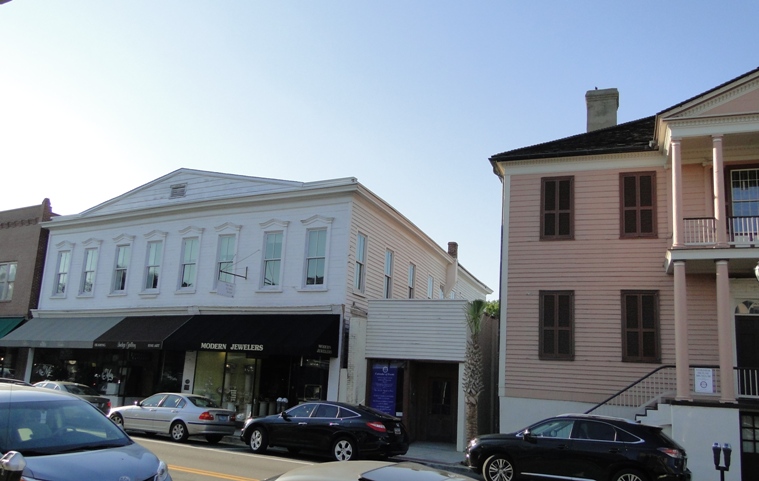
Greetings! I hope your May is blossoming with creative inspiration. On the home front, we’ve been travelling – to Beaufort, S. C. Beaufort was just voted the “happiest seaside town” by Coastal Living Magazine. Home to several thriving art galleries, it’s also on the list of Best 100 Art Towns in America.
Now that we’re back home, we’re gearing up for Seth’s graduation from high school this weekend. For today’s “something to look at,” here’s a project he recently completed for his independent study art class this year. It’s an etching, hand-colored with watercolor:
Morgan will be getting her hands messy this summer, too – fulfilling her art education requirements for her elementary education major. She’s quite crafty, so I’ll be able to share something she whips up here soon I’m sure!
Wishing you creative inspiration wherever life finds you this May, and generous folks to share it with.
If I had to clear out my shelves and give up all but one book about illustrating children’s books, I’d keep Uri Shulevitz’s classic, WRITING WITH PICTURES – How to Write and Illustrate Children’s Books (Watson-Guptill Publications). I have the bona fide 1985 version, which includes chapters on color separation – a process unknown to young illustrators today, I’m sure!
I revisited this wonderful volume this past week because I had to list a favorite quote for a blog interview appearing today at Check It Out. I snuck in two quotes – one on haiku writing and one for art, the Uri Shulevitz quote I have literally written on my wall above my drawing table:
Give up the idea of the perfect flawless picture, and aim for one that is alive instead.
The book contains hundreds of examples of illustration that is alive, mostly Shulevitz’s own work but also work by other artists, including many classics. Shulevitz won the Caldecott medal in 1969 for Arthur Ransome’s retelling of THE FOOL AND HIS FLYING SHIP and a Caldecott honor in 1980 for THE TREASURE. Born in 1935 in Warsaw, the young Shulevitz and his family fled from Poland during World War II. He lived in France and Israel before settling in New York to work and teach.
WRITING WITH PICTURES delves into what makes a story with a complete action as well as the finer points of drawing technique, style, and composition. It includes the best examples I know about creating a storyboard and dummy. For a taste, here is an excerpt from the book as tutorial on the site, Mighty Art Demos, which says the tutorial is reproduced with permission from the publisher. While this is a pretty thorough excerpt, I’d still encourage anyone to purchase the book, chock-full of clear explanations and insights about the process from beginning to end. Here are a few more quotes, to give you an idea:
A picture book is closer to theater and film, silent films in particular, than to other kinds of books. It is a unique type of book. (p. 16)
For a story to succeed, the reader must be engrossed in each successive moment of the story and must care about what happens next, or at least be curious enough to want to know. (p. 41)
Outstanding illustrations are effective on at least two levels. First, they tell us the story, portraying the subject matter accurately; and second, the abstract pattern of the picture is alive in its own right, with an underlying geometric structure that gives character and strength to the forms. (p. 129)
Great stuff, no? I have other books on illustration that I treasure, but this one captured me early on and still rings true. Do you have any favorites?