Art Break Wednesday: Q and A with Melanie Hall and Book Give-away

**First, congratulations to Jo, whose name was randomly picked from last week’s commenters to receive a pack of notecards.** :0)
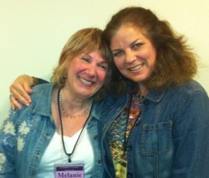
Melanie Hall and yours truly at a Highlights Founders Workshop, May 2012

Today we have a lively treat. Melanie Hall is an artist, illustrator and teacher from New York’s Hudson River Valley.  Her 25 children’s books have garnered many awards including the Parents’ Choice Award for an outstanding picture book and the Sydney Taylor Notable Book for 2011, as well as favorable reviews from the New York Times Book Review.  Her work, often described as sophisticated and whimsical,  has been exhibited at the Original Art Show at the Society of Illustrators (NY) and in many galleries.  She teaches graduate courses in children’s book illustration at Marywood University in Scranton, Pennsylvania, as well as professional workshops.

I met Melanie at the 2011 Highlights Founders Workshop for Advanced Illustrators at Boyds Mills, Pennsylvania, led by an esteemed team of amazing illustrators:  Melanie, Lindsay Barrett George, Eric Rohman, Floyd Cooper, and Suzanne Bloom.
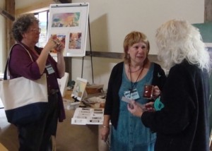
Suzanne Bloom taking pictures as Melanie Hall and Lindsay Barrett George chat at the 2011 Highlights Founders Advanced Illustrators Workshop

The Highlights workshops are tremendous.  Little cabins to create and relax in are heavenly, and the new “Barn” is a terrific facility for group gatherings.  The natural setting is rejuvenating.  But the best thing about these workshops is the faculty.   I cornered Melanie toward the end of the workshop to discuss her poetry book projects, since poetry is my first love and I’d love to illustrate my own poems.  She kindly looked at my work and offered helpful insights.  What struck me most about Melanie was not just her expertise and her ability to articulate concepts, but the joy that emanates from her work and her person.  She looked at a couple of pieces I’d made and said, “You had fun creating that, didn’t you?”  She challenged us to make the kind of work we took joy in, which reflected our personalities.

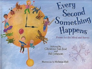
One of my favorite books Melanie has illustrated is EVERY SECOND SOMETHING HAPPENS – POEMS FOR THE MIND AND SENSES (selected by Christine San José and Bill Johnson.)  I had the good fortune to meet Bill Johnson at the Highlights Founders “Poetry for All” workshop this past May.  Melanie was a guest presenter there, and it was wonderful to catch up with her and hear about her process of illustrating poetry.  Her collages, paintings, and drawings reflect the variety of voices in EVERY SECOND…, which includes the work of renowned poets and also poems from children.  (See my blog post for more about the book.)  And, drumroll…. I’m offering a copy to one lucky commenter randomly selected this week! (See details below.)
Melanie kindly offered to drop by here today and answer a few questions about herself and her art.

Welcome, Melanie!  Tell us a little bit about your background.  Were you one of those kids who doodled your way through class?

Yup. The girls asked me to draw horses for them in grade school. No one else could figure out how to draw them. They thought it was cool the way the images just came out of my pencil. I did, too.

“Fireworks” – ©Melanie Hall, HIGHLIGHTS magazine illustration

How and when did you decide to pursue art as a career?

When I was a senior in high school, I decided to go to art school. Dad was not happy. He said I would “starve in a garret.” He was very proud of me when I became an editorial illustrator and did annual reports and magazine and newspaper illustrations.

What is it about mixed media that you particularly enjoy?

 I love being surprised how things turn out. It’s not always what I intended, because the right side of the brain is a genius , and if I just get out of the way, my images become inventive, freer,  exciting and filled with spirit.

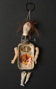
©Melanie Hall – Clock Doll, assemblage

You wear many hats  berets – artist, illustrator, teacher.  How do you balance the different requirements for each of these pursuits?  (Do you need time away from people in order to create, or do you need to get away from the studio to be with other people?)

Great question. I have to carve up my time to pursue all my interests. Sometimes it means that I work on several different projects in one day: in the morning I’ll do one thing, and then after lunch I’ll do something else, and then at the end of the day I’ll reward myself with personal art.

I used to think it was nutty of me, but I realized it works for me!

In my notes from one of your workshops , I wrote that you said, “What turns my buttons on is to play.”  How do you free yourself to play when approaching a new work?

I arrange some of my favorite pieces of artwork near my drawing table to look at while I’m working so I can get back into that frame of mind.

I also love to look at the masters of both fine art and illustration. For instance, I’ll look at a book of Toulouse Lautrec’s posters or a Martin and Alice Provensen picturebook.

So I guess it’s visual inspiration that gets me going.

Do you have favorite sources of inspiration?

 From time to time, I need to spend the day at a museum to feast my eyes and breathe in that incredible atmosphere; the Metropolitan is one of my favorites. That’s where you’ll find me every year on my birthday to celebrate life.

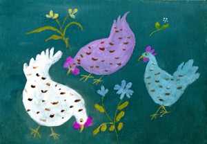
©Melanie Hall – “Hen Party,” mixed media on board

What are the tools you can’t live without – the items you use over and over again in your studio?

My electric eraser, my“Black Warrior” pencil, and Arches 140 lb. hot press watercolor paper with the wonderful deckled edge.


(I love that deckled edge, too!) Looking ahead, are there any works-in-progress or plans floating out there you’d like to share with us?

Yes, I am writing and illustrating a picture book. I’m on Revision # 6. Each version is better than the one that came before.

Thank you for playing along, Melanie!

Visit Melanie at her website and her Etsy shop.

To read more about the Highlights Illustrators workshop from last year, here’s my blog post about it.

To be entered to win a copy of EVERY SECOND SOMETHING HAPPENS, please leave a comment below by midnight EST Monday, Oct. 22.  Do you have a favorite way to “play” to free up your creative side? One lucky art lover will be randomly selected and notified next week.
Art Break Wednesday: Relief Printmaking Photo-Demo


First, CONGRATULATIONS to Rebecca for being the randomly chosen winner of Pam Carriker’s ART AT THE SPEED OF LIFE.  Thanks to everyone for leaving comments on that first Art Break Wednesday post.  Keep checking back for more give-aways!  (Today it’s a pack of notecards….)

A couple of weeks ago, a teacher in Arizona emailed me to ask permission to use a few relief prints posted on my author website in a power point for fourth graders. (I love fourth graders!) She’s doing an art unit.

I decided it’s high time I also make a simple photo-demonstration of the process.  I’ll post this info here now, and soon on my author website and on this one as part of a forthcoming page featuring technique demos.

©2012 Robyn Hood Black

ALL IN A DAY’S WORK

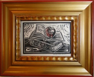
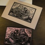
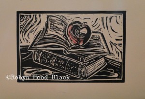
Here’s how I made a 4 in. X 6 in. relief print last week.  I wanted to create an image that might brighten a teacher’s day. (I love teachers!)

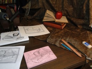
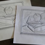
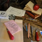
I set up a small still life in my studio with vintage books and a good ol’ red delicious apple.  After a rough sketch, I fine-tuned one.  Often I’ll use my light table or scan the sketch into the computer to reverse the image.  I don’t do digital art, but this speeds along the process.  (You can transfer the image without reversing if you don’t mind that the direction will be the opposite.  Otherwise, the final sketch you see needs to be the reverse of what you want as a printed image.)


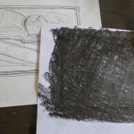
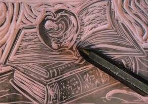
I rub the back of the final sketch with a big pencil or graphite, then place it over a blank block to outline.   I don’t go into great detail when transferring the drawing; for me, the magic always happens in the carving.  Especially if I have some lively Celtic music playing on Pandora.

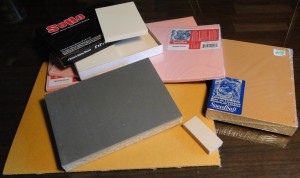
Carving blocks come in many varieties these days. There’s traditional linoleum of course, but also products from manufacturers designed to make carving easier.  Try out several.  For this project, I used a 4 X 6 block of Speedball Speedy-Carve.  Smaller plates or stamps can be made with erasers!

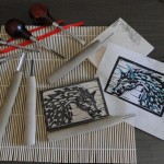
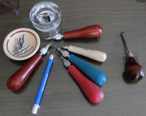
Here are tools for woodcuts – a topic for another day! It’s a good idea to keep these carving tools just for wood.


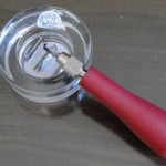
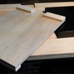
Carving tools must be handled with great care. A few handles will make carving easier, as you won’t have to stop all the time to change blades.  I most often use a v-gouge.  Speedball also has a set of modified blades (“Linozips”) which are designed to be a little safer, but I don’t personally like them as well as the traditional ones.  Also, you have to pull them toward you rather than push them away.  I wouldn’t allow young children to use any of them.  They could experiment with making impressions in Styrofoam with pencils, or other introductory methods.  Older students would need safety instruction before carving.  I use a bench hook – these grab onto the edge of your work surface and have notches which will hold corners of your block as you are carving it.


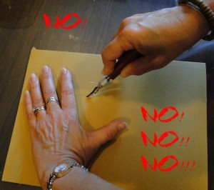
This is a ticket to the ER. Never carve with your supporting hand in front of the blade.


There, that’s better!


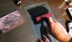
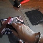
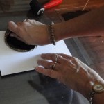
As I carve the design, and again when I think I’m done, I rub graphite over the surface to get a sense of how it will work – dark areas are where the ink will be. I use either Speedball water-based ink (if time is a factor) or, my favorite, Caligo Safe-Wash Relief Ink.  It’s oil-based, but cleans up with water!  It does take a few days to fully dry, however.  And, though I love the smell of ink, I do open windows and recommend using with good ventilation.  I use a piece of glass (should be tempered on edges for safety) to roll out the ink on.  A healthy dab or two to start is good. It takes a little practice to get the “feel” of when the brayer is “charged” and ready.  To me, there’s a way the ink snaps (!) – I can feel it and hear it as well.  I roll the ink onto the block, varying direction with each set of passes until it’s covered.


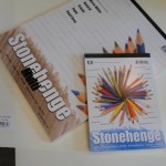
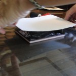
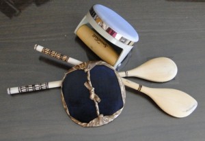
Try out different papers.  My favorites are Stonehenge and Rives printmaking papers.  You can get a pack of Speedball Mulberry paper at the large art/craft supply stores that works well, too.  Here’s the tricky part:  If your work is small enough like this one, you can simply lay the paper over the top to print it.  Larger works or works with more than one color of ink, which require registration, will need a support.  For these small prints, I turn the paper over, visualize the borders I want, let it hover just a sec to make sure it is an even distance from the block, then I gently lay it on top.  (Don’t jiggle or move it in any way.)  I usually secure it with a tip of a fingernail in the middle, then rub the back of the paper with a baren.  (I do this by feel, too – trying to apply even pressure in circles.) These can be official barens, like this Japanese-made one below, or the back of a worn wooden spoon.  If you are printing on thin paper, you’ll want a barrier between the paper and the baren (Glassine or a paper that won’t stick to any seeping ink.)

Of course, you can use a printing press if you have access to one.  For small prints, I enjoy making each one by hand the whole way.  Oh, and I don’t have a printing press anyway… .


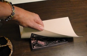
Now for the reveal – carefully pull up your paper, and, Voila! I do this in a slow but deliberate motion so the paper comes right up.  See?  A lovely, we hope, print which is the reverse image of the carving on the block.


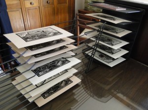
The masterpiece needs to dry.  And, you’ll want to make more copies, called an edition.  (I find I have to wash off the block every 5 to 10 prints and thoroughly dry it before printing more, if I want a uniform edition that’s not muddy.  That goes for the inking plate too if I’m printing a lot.) The edition can be open (as many prints as your block can make cleanly before showing wear), or limited to a certain number, which you would likely note when you signed them.  (5/20 would mean it’s the fifth print of an edition of 20.)  Many artists destroy the block after the edition is printed.  You can certainly buy fancy drying racks, but for my prints which range in size up to about 9 X 12 or so, I improvise.  I’m cheap resourceful. I use metal sorters from the office supply store, turned on their sides and, for larger prints, placed opposite each other.

Sometimes I add a finishing touch – just a hint of a color or two in thinned gouache.  Here it is on the apple, a bit of juicy red.  Many prints I prefer in their simple black and white glory.

When your print is dry, sign it in pencil and enjoy!

I’m offering this image in my Etsy shop as a hand-pulled print and also commercially printed on notecards.  Said notecards are scheduled to arrive in a big brown truck in my driveway any day now.  If you’d like to be entered into a random drawing to receive a package of 8 from moi, please leave a comment anytime by next Monday, Oct. 15, at midnight EST.  I’ll email the winner for his/her address and announce it next week.

Oh, and my favorite sources for printmaking supplies?  Try McClains and Stampeaz.  Thanks, and happy printmaking!

Notan, Anyone?


Wherever we are in our artistic journey or career, it’s helpful to circle back sometimes to the basics. You know, those concepts that are SIMPLE, familiar even – but not necessarily easy!

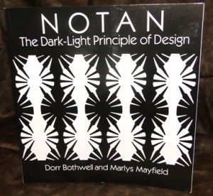
Recently I stumbled upon a book I’m enjoying working my way through. It’s a Dover (1991) republication of a book published in 1968 by Renhold Books Company: NOTAN – The Dark-Light Principle of Design by American artists and teachers Dorr Bothwell and Marlys Mayfield. It’s not a hefty volume, a paperback measuring less than 9 X 9 in. But it holds treasures!

The explanation on the back cover describes it better than I can:

As a guiding principle of Eastern art and design, Notan (a Japanese word meaning dark-light) focuses on the interaction between positive and negative space, a relationship embodied in the ancient symbolism of the Yang and the Yin. In composition, it recognizes the separate but equally important identity of both a shape and its background.

I was intrigued by the book for several reasons, including my love of haiku and subsequent interest in learning more about Japanese art and design. Also, my mind drifted back to explorations of “positive and negative space” in art classes in college many moons ago. I don’t remember learning the word Notan, but I remember studying similar concepts.

I love to experience and create art in black and white. And, as I’ve taken up calligraphy again, practicing elements of balance, space, tension, and reversals will improve my art in that area too.

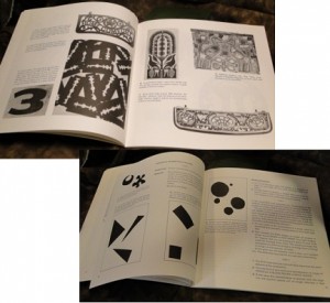
This book offers an introduction to the concepts along with history, and then six exercises which increase in complexity. You can’t do the exercises without pondering properties such as balance and tension. (AND, for these problems, you are limited in materials – just black, white, and later gray construction paper – and scissors and paste!)


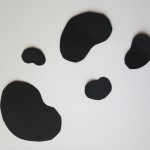
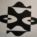
A couple of my exercise pages – a bit rough, but you can see how fun they are!

One sees masks emerge, no?


©Robyn Hood Black. All rights reserved.

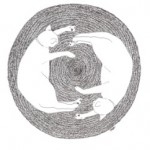
A pen-and-ink drawing I did a long time ago has been the most popular image I’ve ever drawn, and I think it’s because of its yin/yang quality – Notan, if you will.


You can certainly make art with properties of Notan without ever studying the concepts or learning the vocabulary. In fact, many examples in the book come from primitive or folk art.  The authors contend people naturally create this way if we are not separated from nature. But if you do decide to round up a copy of the book and take the exercises for a spin, just try to make it  through the day without seeing Notan all around! It will improve your composition and artmaking to boot.

The book is available from online booksellers, or, better yet, maybe your favorite indie bookstore can order it for you. Easy to see while it’s still in print after all these years.

I’d love to know how you work with positive and negative space, or if you have any other thoughts on this topic – won’t you leave a comment?

Also, if you missed commenting in last week’s post, you can still do so and be entered to win a copy of Pam Carriker’s ART AT THE SPEED OF LIFE. One winner will be randomly chosen from comments left at that post before midnight EST Monday, Oct. 8, and announced next week.
Thanks for joining in!

Art Break Wednesday – and a Book Give-away!


WELCOME to ART BREAK WEDNESDAY here on artsyletters!   Grab your coffee or tea and visit each week to find creative inspiration, camaraderie, and special give-aways.

What inspires you?

As a writer/poet, I’m a sucker for the written word.  My recent artistic adventures reflect that – whether in subject matter (books, etc.) or in substance (vintage book pages, old typewriter parts and keys, and the like.).  While my artwork is predominantly black and white, sometimes I like to color things up a bit.

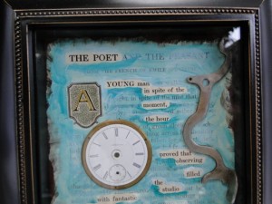
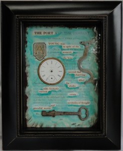
Here’s how I made the 5 X 7 collage I featured in my Poetry Friday post last week on my writer blog.

(detail)


First, I found a section of text from a vintage book that had “found poem” possibilities (double-checking online first to make sure it wasn’t the last rare copy of this edition or anything!).  This is page 206 of the 1922 JOURNEYS THROUGH BOOKLAND (Vol. 6) compiled by Charles H. Sylvester. It’s the first page of a story called “The Poet and the Peasant” by French novelist Emile Souvestre.


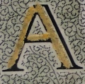
I added a little bling to that inviting initial “A” in the form of some 23-kt gold leaf.


Then I played with the text on a photocopy to “find” my poem before working on the real page of text.  I wanted to use the first part of the story title to call the poem, “The Poet.”  I applied blue-green gouache washes (mixed with gel medium) to the page, leaving the words I wanted highlighted untouched.  I added some darker washes underneath the words to make them pop. Then I sprayed workable fixative on the page.  When dry, I applied acrylic gloss medium over all of it.

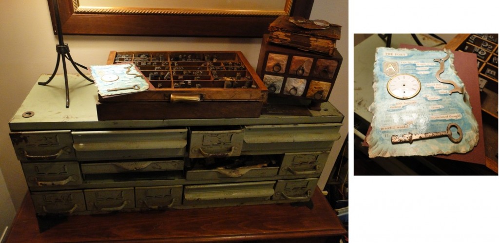
Now for the fun part!  I wandered over to my old metal cabinet (does anyone know what this was originally for?  I snapped it up on a trip with my artist friends, Paula and Beth, at a local antiques market day).  It’s full of recent treasures such as vintage objects and old metal pieces I’ve found on Etsy or picked up on the side of the road!  It also holds small letterpress letters and antique type keys and such.

I tried out a few elements to arrange on the page as a collage and settled on these.  The beautiful old watch face, vintage key, and vintage Remington typewriter part were all Etsy finds.

©Robyn Hood Black. All rights reserved.
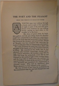
I glued them on to the altered page, placed the piece in a frame that could be used as a shallow shadowbox (from a local art/craft store), and, Voila!  Now I have a mixed-media tribute to the observational qualities of “The Poet.”


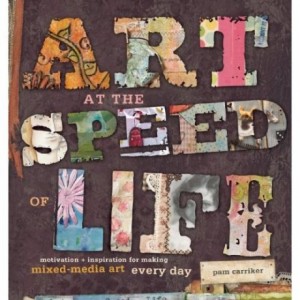
Another essential source of inspiration for me is enjoying the creative work of others – in museums, online, or in books and magazines.  I’ve just read ART AT THE SPEED OF LIFE by Pam Carriker (Interweave Press, 2010).  This mixed media artist and blogger offers up a feast for busy artists.  You can savor a variety of artists and projects at a leisurely pace or grab your inspiration “to go” – the author offers “Speed of Life” versions of instructions for some of the featured works, perfect to fill an art journal in just a few days.  Whatever pace you prefer, I’d love to send you this copy!

Please leave a comment below about what inspires YOU, and you will be entered in my first book give-away.  [Deadline for Entry is midnight EST Monday, Oct. 8.]  One winner will be randomly selected, and then I’ll email you for your mailing address.  Thanks for playing along!


[Two of Robyn’s found poems for children appear in Georgia Heard’s THE ARROW FINDS ITS MARK (Roaring Brook, 2012), illustrated by Antoine Guilloppé.   This featured shadowbox and other altered pages artwork can be found in her Etsy shop – more coming soon! ]