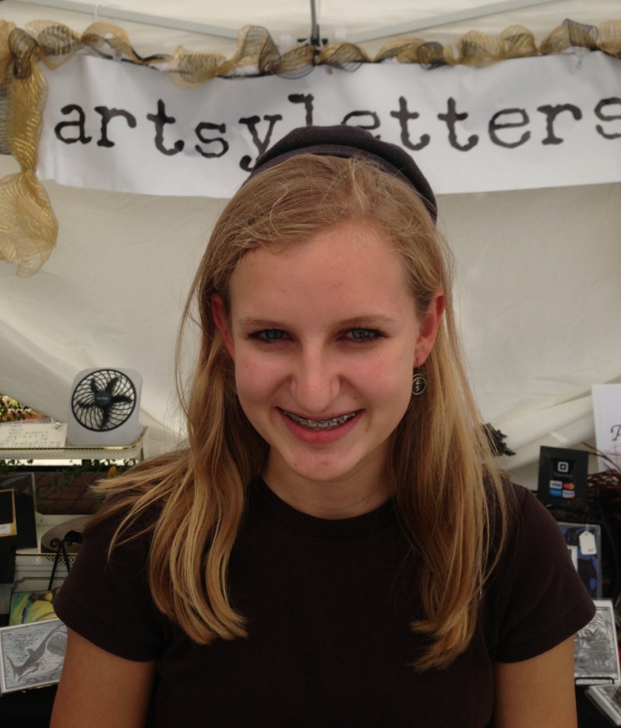
Seems an appropriate season (and time – it’s coming up on midnight!) to share another recent mixed media adventure. As my daughter, Morgan, was helping me enter items into my Square inventory on my mini iPad, she asked, “What do I call this? Gothic Shakespeare?”
I liked the name.
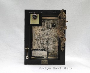
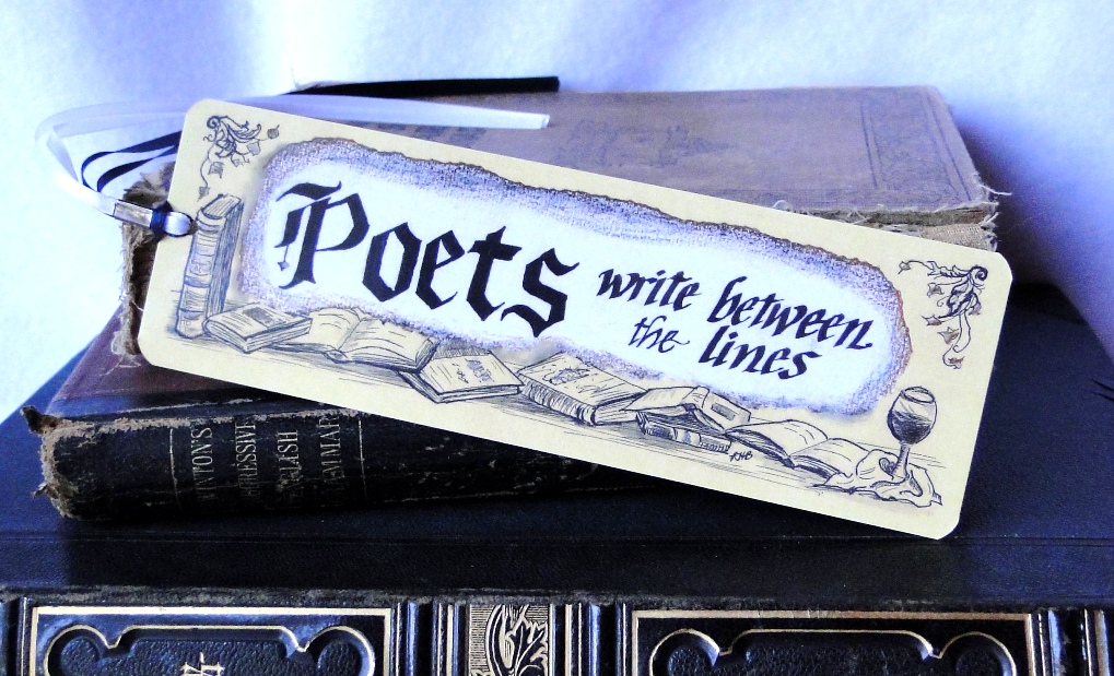
This 6 in. by 8 in. shadow box features an embellished experiment. I printed my fairy door relief print design on a page from a vintage reader, and the result was rather ethereal and dreamy – but gritty, too. I loved its mysterious “air” and pondered using it as the backdrop for an altered page collage. Pondering turned to pasting…
Somehow a vintage typewriter key seemed perfect to place near the top – the numeral 0 with a parenthesis which looks quite like a moon. Then, the “Floating Shift” key, featured in a copper tray and attached to a mini canvas on light green paper and a 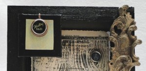 painted black background, floated itself up in a corner.
In another vintage book, I found a wonderful snippet from Shakespeare’s “The Winter’s Tale” – this seemed just right:
Hermione. Pray you sit by us,
And tell’s a tale.
Mamilius. Merry or sad shall ‘t be?
Hermione. As merry as you will.
Mamilius. A sad tale’s best for winter.
I have one of sprites and goblins.
Hermione. Let’s have that, sir.
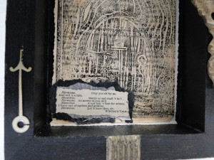
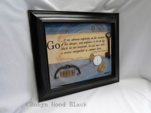
Beside this text I added an old clock hand (the reverse side – the lighter color contrasts with the black frame), and a small vintage metal rectangle graces the bottom edge. On the top right, I placed this luscious little embellished metal door hardware. (This was a find from my favorite antique dealer at the monthly Flowery Branch (Ga.) Antiques Market – I was able to get a few!)
Here’s hoping a little haunted art makes you smile. Wishing you ghoulish inspirations as the month carries on… Bwa haaa ha ha ha.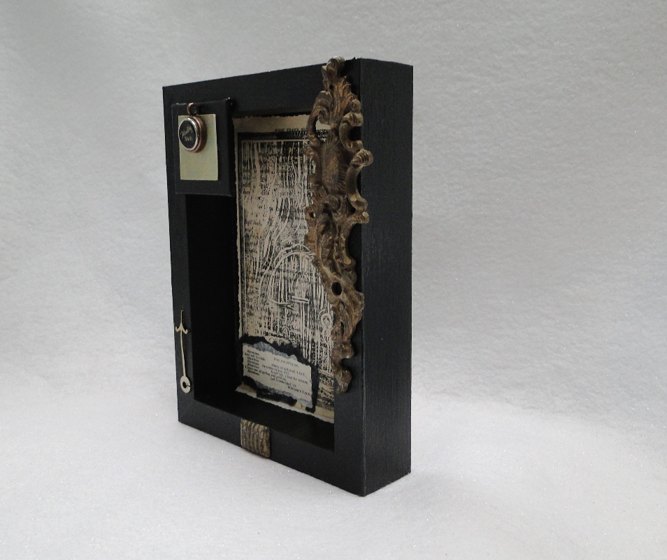

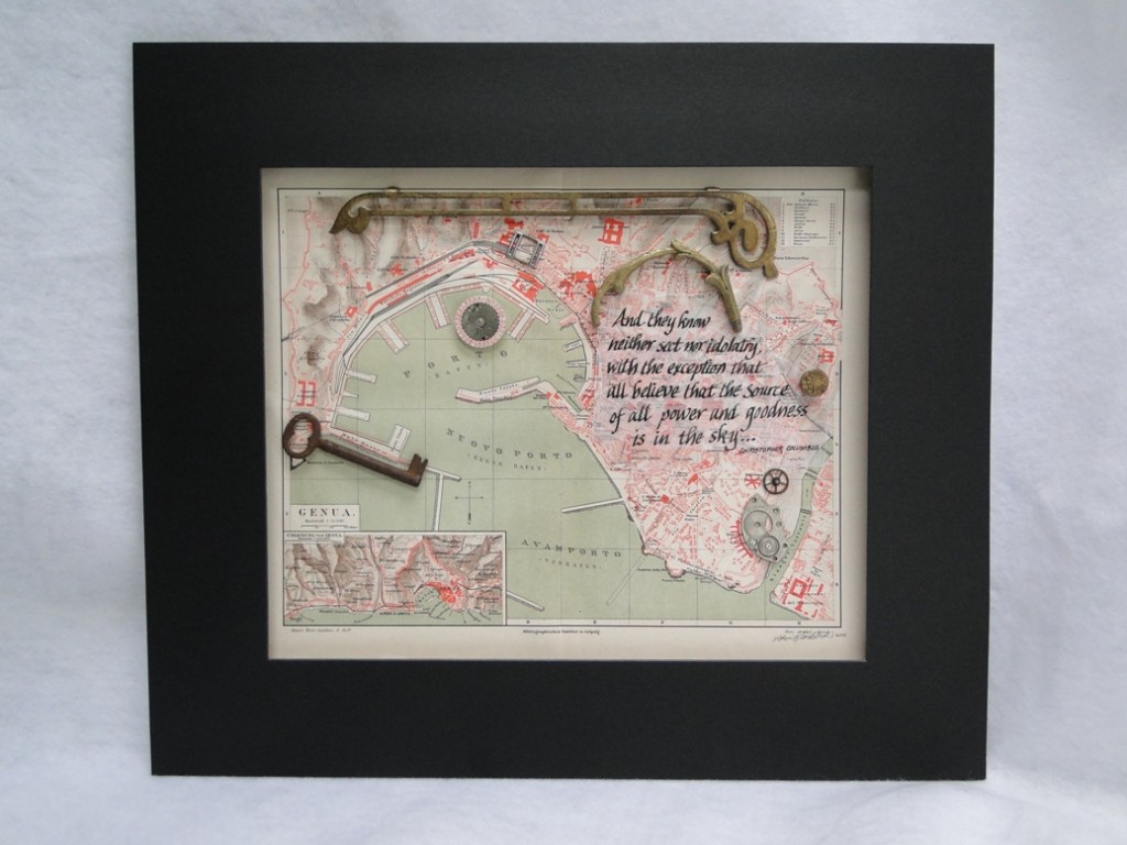
 features various watch components and decorative metal embellishments from a variety of sources, namely antique markets and Etsy vintage shops. A peek into how I chose to put what, where:
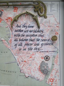
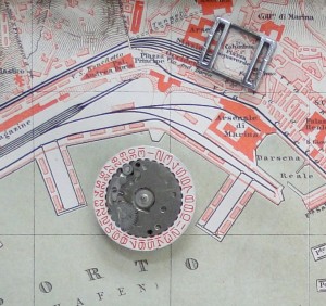 First, this round metal watch component with the red calendar numbers on a white background seemed perfect color-wise for the piece, and I love the suggestion of time having to do with anything historical. I “highlighted” Columbus Piazza on the map with a small vintage silver component.
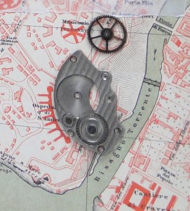 of these vintage watch parts seemed echoed in the shapes near them on the map, with the circle and spokes, and then the arch/ray image:
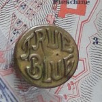 I couldn’t resist adding the brass vintage “True Blue” button beside the quotation about the sky! As far as the larger brass embellishments, I placed them at the top of the map to frame the whole image. Notice how the “arched” piece on the right echoes the shape of the harbor at the shoreline immediately to its left.
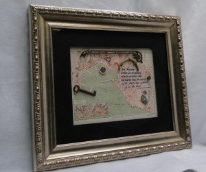

 and more thick black lettering, too. Wishing you a creative October, whatever time zone you’re in!
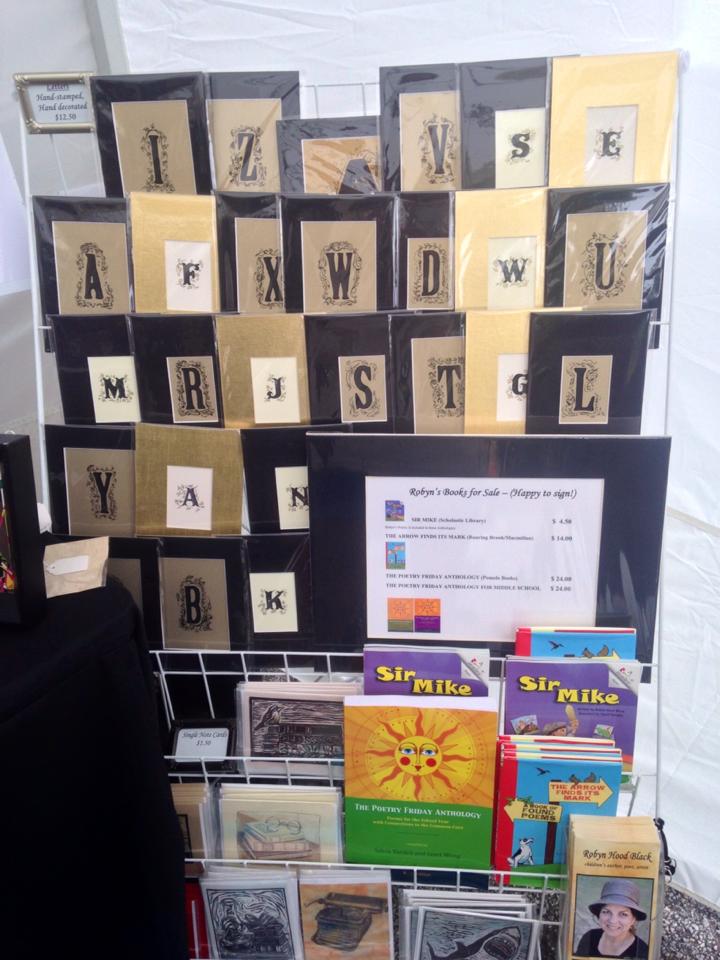
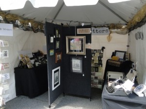
 Why were these special?
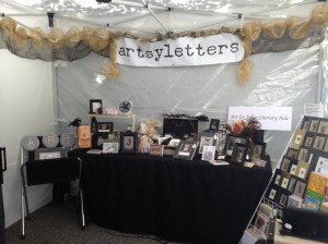 I had to sacrifice one side of a panel, but the extra space was more than worth it.
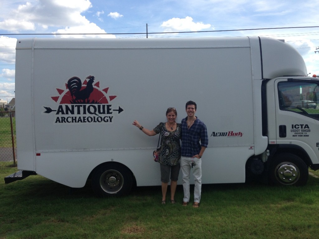
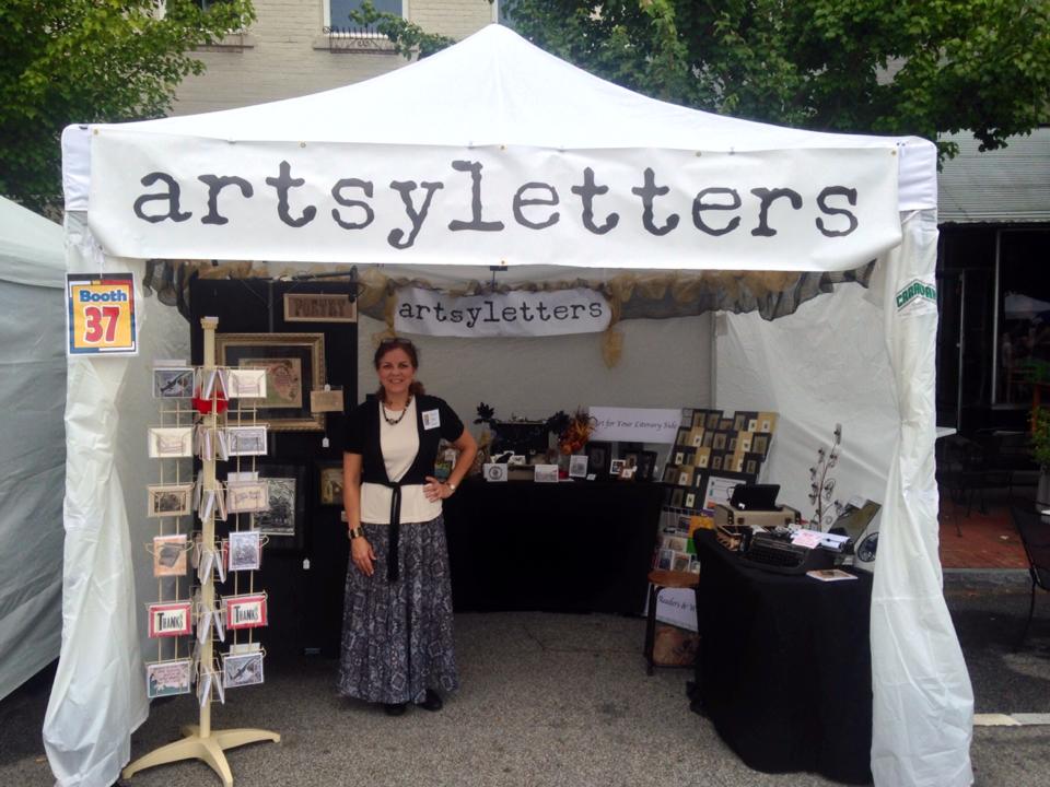
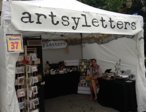
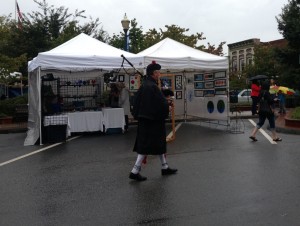
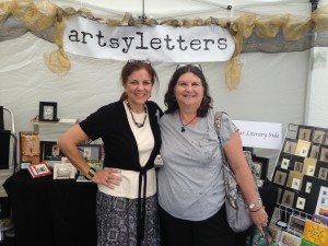
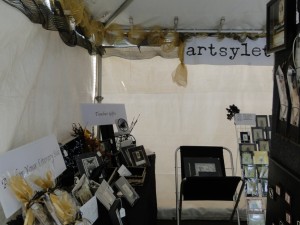
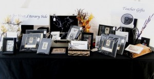
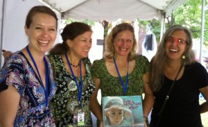
 All in all, even with Saturday’s washout, it was a good weekend. Thanks to my father-in-law, Reuben, who helped break down and pack up my booth after Morgan had to get back to school. I finally got my car unpacked, but don’t ask if everything’s put away yet… ;0) Some of it won’t be right away, anyway – I’ll be listing these new items I made for the show in my Etsy shop very soon!

 Whew! The streets have no doubt been swept after
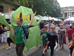


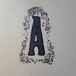
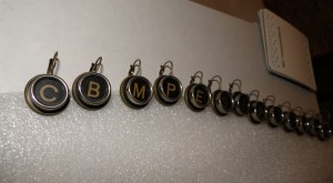


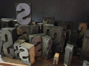
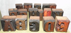
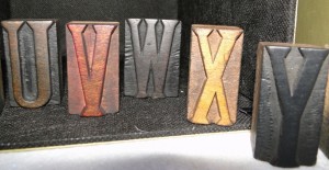
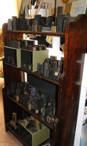 I enjoy the letters every day now, and I have easy access to them for projects.
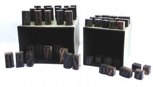 With a specific project in mind in which I’ll hand-stamp their impressions (you’ll see soon – promise), I purchased TWO sets. I just couldn’t decide, and I wanted the two different sizes. The larger blocks are about two inches tall, and the smaller ones about an inch.