First, CONGRATULATIONS to Rebecca for being the randomly chosen winner of Pam Carriker’s ART AT THE SPEED OF LIFE.  Thanks to everyone for leaving comments on that first Art Break Wednesday post. Keep checking back for more give-aways! (Today it’s a pack of notecards….)
A couple of weeks ago, a teacher in Arizona emailed me to ask permission to use a few relief prints posted on my author website in a power point for fourth graders. (I love fourth graders!) She’s doing an art unit.
I decided it’s high time I also make a simple photo-demonstration of the process. I’ll post this info here now, and soon on my author website and on this one as part of a forthcoming page featuring technique demos.

©2012 Robyn Hood Black
ALL IN A DAY’S WORK
Here’s how I made a 4 in. X 6 in. relief print last week. I wanted to create an image that might brighten a teacher’s day. (I love teachers!)
I set up a small still life in my studio with vintage books and a good ol’ red delicious apple. After a rough sketch, I fine-tuned one.  Often I’ll use my light table or scan the sketch into the computer to reverse the image. I don’t do digital art, but this speeds along the process. (You can transfer the image without reversing if you don’t mind that the direction will be the opposite. Otherwise, the final sketch you see needs to be the reverse of what you want as a printed image.)


I rub the back of the final sketch with a big pencil or graphite, then place it over a blank block to outline. I don’t go into great detail when transferring the drawing; for me, the magic always happens in the carving. Especially if I have some lively Celtic music playing on Pandora.
Carving blocks come in many varieties these days. There’s traditional linoleum of course, but also products from manufacturers designed to make carving easier. Try out several. For this project, I used a 4 X 6 block of Speedball Speedy-Carve. Smaller plates or stamps can be made with erasers!

Here are tools for woodcuts – a topic for another day! It’s a good idea to keep these carving tools just for wood.

 Carving tools must be handled with great care. A few handles will make carving easier, as you won’t have to stop all the time to change blades. I most often use a v-gouge. Speedball also has a set of modified blades (“Linozips”) which are designed to be a little safer, but I don’t personally like them as well as the traditional ones.
  Also, you have to pull them toward you rather than push them away. I wouldn’t allow young children to use any of them. They could experiment with making impressions in Styrofoam with pencils, or other introductory methods. Older students would need safety instruction before carving. I use a bench hook – these grab onto the edge of your work surface and have notches which will hold corners of your block as you are carving it.

This is a ticket to the ER. Never carve with your supporting hand in front of the blade.


There, that’s better!
As I carve the design, and again when I think I’m done, I rub graphite over the surface to get a sense of how it will work – dark areas are where the ink will be. I use either Speedball water-based ink (if time is a factor) or, my favorite, Caligo Safe-Wash Relief Ink. It’s oil-based, but cleans up with water! It does take a few days to fully dry, however.  And, though I love the smell of ink, I do open windows and recommend using with good ventilation. I use a piece of glass (should be tempered on edges for safety) to roll out the ink on. A healthy dab or two to start is good. It takes a little practice to get the “feel” of when the brayer is “charged” and ready. To me, there’s a way the ink snaps (!) – I can feel it and hear it as well. I roll the ink onto the block, varying direction with each set of passes until it’s covered.

Try out different papers. My favorites are Stonehenge and Rives printmaking papers.  You can get a pack of Speedball Mulberry paper at the large art/craft supply stores that works well, too. Here’s the tricky part: If your work is small enough like this one, you can simply lay the paper over the top to print it. Larger works or works with more than one color of ink, which require registration, will need a support. For these small prints, I turn the paper over, visualize the borders I want, let it hover just a sec to make sure it is an even distance from the block, then I gently lay it on top. (Don’t jiggle or move it in any way.)
  I usually secure it with a tip of a fingernail in the middle, then rub the back of the paper with a baren. (I do this by feel, too – trying to apply even pressure in circles.) These can be official barens, like this Japanese-made one below, or the back of a worn wooden spoon. If you are printing on thin paper, you’ll want a barrier between the paper and the baren (Glassine or a paper that won’t stick to any seeping ink.)
 Of course, you can use a printing press if you have access to one. For small prints, I enjoy making each one by hand the whole way. Oh, and I don’t have a printing press anyway… .

Now for the reveal – carefully pull up your paper, and, Voila! I do this in a slow but deliberate motion so the paper comes right up.  See? A lovely, we hope, print which is the reverse image of the carving on the block.

The masterpiece needs to dry. And, you’ll want to make more copies, called an edition. (I find I have to wash off the block every 5 to 10 prints and thoroughly dry it before printing more, if I want a uniform edition that’s not muddy. That goes for the inking plate too if I’m printing a lot.) The edition can be open (as many prints as your block can make cleanly before showing wear), or limited to a certain number, which you would likely note when you signed them. (5/20 would mean it’s the fifth print of an edition of 20.) Many artists destroy the block after the edition is printed. You can certainly buy fancy drying racks, but for my prints which range in size up to about 9 X 12 or so, I improvise. I’m cheap resourceful. I use metal sorters from the office supply store, turned on their sides and, for larger prints, placed opposite each other.
Sometimes I add a finishing touch – just a hint of a color or two in thinned gouache. Here it is on the apple, a bit of juicy red. Many prints I prefer in their simple black and white glory.
When your print is dry, sign it in pencil and enjoy!

I’m offering this image in my Etsy shop as a hand-pulled print and also commercially printed on notecards. Said notecards are scheduled to arrive in a big brown truck in my driveway any day now. If you’d like to be entered into a random drawing to receive a package of 8 from moi, please leave a comment anytime by next Monday, Oct. 15, at midnight EST. I’ll email the winner for his/her address and announce it next week.
Oh, and my favorite sources for printmaking supplies? Try McClains and Stampeaz. Thanks, and happy printmaking!

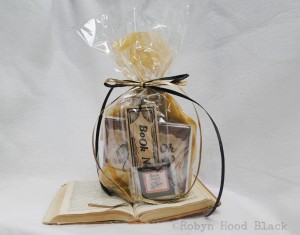
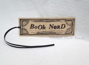
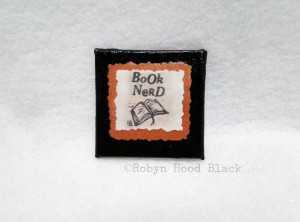
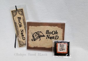
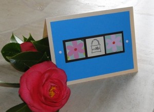
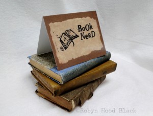 First, a package of “Book Nerd” note cards. I made the original design for these with my little book relief print carving and hand-stamped the words “BoOk NeRD” with vintage metal letterpress type, all on torn paper. (The notecard reproductions suggest this texture, but are completely flat.)