Art Break Wednesday – Happy New Year, and Painting with Pencil?


Happy New Year!

I hope 2013 brings you lots of creative inspiration.

I’ve enjoyed reading other folks’ resolutions and plans for the coming year.  I have lots of projects up my sleeve, but at the risk of expending energy in the wrong place (talking about them) rather than the right place (um, doing the work), I’ll keep most of mine close to the vest.  I know myself too well.

Stumbled upon this great quote this week:

    Art, like morality, consists of drawing the line somewhere.

G.K. Chesterton (1874-1936)  (G.K. Chesterton quotes are the best.)

I’m already starting the year off a wee bit behind, as I’m getting today’s post up in the afternoon, rather than having ready to go just after midnight each week, which is what I try to do.  But, life isn’t perfect and neither am I;  may as well get all that out of the way early in this New Year.  (Confession:  I still have to take down our Christmas decorations and deliver a couple of “Christmas Eve” gifts… .)

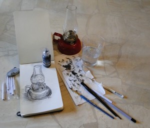
In the spirit of drawing the line somewhere, though, I decided to take a break today from the “urgent” and spend a few minutes actually sketching in my journal.  (One of my goals for this year is to do more of that – sketching.)  AND, I decided to break open a fun new product I ordered in the fall – Pam Carriker’s “Liquid Pencil” Sketching Ink by Derivan.

Step One:  Find my sketch journal. (Yes, I had to look for it.)

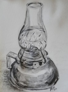
Step Two:  Find a suitable subject.  I started out with the tiny young Chihuahua we rescued over Thanksgiving.  She was an eager subject but way too active.  I then settled on a wonderful small red vintage oil lamp that I bought on Etsy a month or so ago.  It has a lovely shape and a variety of textures with its metal base and glass globe.

Step Three:  Jump in.

I was a little skeptical about this pencil-in-a-bottle – what’s wrong with drawing with an actual pencil?  But I tried it on a brush and even a dip pen, and I must admit – it’s fun.

You get that lovely graphite look and feel, but with loose strokes and washes, and concentrated darks for contrast.  I simply used varied amounts of water here and there to thin the solution before dipping in.  A tortillon worked great for blending, and I tried a kneaded eraser in a spot or two with good results as well.

I give Liquid Pencil two smudged thumbs up!  (And don’t let the small size of the bottle fool you… this is potent stuff, so a little goes a long way.)  Be sure to check out the video with application examples at the link above.  I just played before watching, but the video might give you even more ideas.

I look forward to experimenting and “playing” creatively throughout the New Year.  How about you?  Can you “begin where you are” and let loose your Muse?  Thanks for visiting, and please share any thoughts about creativity below.

(And I do hope you’ll drop by each Wednesday.  Let’s see what we come up with this year!)
Art Break Wednesday: Remembering Angels


Yay Images

Just a short post today, remembering those whose lives were lost or forever changed in last Friday’s tragedy at Sandy Hook Elementary School.

I had left the house Friday morning for a short school event for my high school senior, when news reports were sketchy, indicating there had been some kind of shooting and possibly one death. I recognized the name of the town as the place where my best friend from college had grown up.

On the way home, I passed one of our town’s elementary schools.  It happened to be the day our local public high school football team was heading to the Georgia Dome for the state championship (which they won).  The elementary kids were all lining the street with exuberant expressions on their painted faces – waving signs, cheering in anticipation of what I assumed was a forthcoming parade of the team.  My daughter was already home from college, and, as an elementary/early childhood major, she LOVES kids.  I couldn’t wait to tell her about how cute all those kids looked lining the road, decked out in red and white, herded by their watchful teachers.

When I walked into the house and looked at the TV, the horrific truth of the massacre at Sandy Hook was emerging.  I raced to the sink, needing to retch.  Needless to say, like the rest of the nation, my daughter and I cried through the unfolding story and many times since.  No words are adequate, of course.

I stumbled upon this feature story of some kids in Ohio making art to send to Sandy Hook.  During their Christmas program yesterday (Tuesday) morning, they also raised more than $600 in donations for victims and families.  These are children from St. Michael’s Catholic School in northeast Ohio. For their creative project, designed by art teacher Cathy Bravis, each student is lending a fingerprint to make up a bouquet of flowers on a poster.  The bouquet will be in a vase with the students’ signatures.  Plans are for a parent to deliver the poster and gifts when traveling to the area over Christmas break.

You can read more here.

And, if like me you like to send cards, the US Post Office has set up a special post office box to receive messages of condolence.  Here’s the link, and the address is:

P O Box 3700, Newtown, Connecticut 06470

I know I’ll be hugging my own family members a little tighter this year and will be thankful for the beauty and power of art to express emotion and help heal.

(If you know of other artistic projects benefitting Sandy Hook, please feel free to share a link below.)

Wishing you and yours peace this holiday.

Art Break Wednesday: Words – with Friends!


©Robyn Hood Black

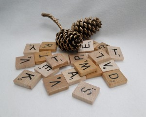
(Apologies for late post – could not get my blog to post this earlier this morning, and I was out all day.) Since my art is all about reading, writing, and letters, I thought it would be fun to look at games involving words and letters.

Last night my writers’ critique group, Bookbound, met for our annual Christmas party hosted by the wonderful and talented Donna H. Bowman. We shared our usual yummy food and “white elephant” gifts, and she also had us play games:  holiday-themed activity sheets for kids.  We had to unscramble words (I was pretty good at that), do a word search, and find hidden pictures.

front: Tracy, K. D., Robyn, Heather
back: Janice, Donna, Lisa, Paula
(photo by Danny Bowman)

Great time had by all, including Paula B. Puckett, K. D. Bryant Graham, Lisa Sterling, Tracy Walker, and our regular-honorary-invited-guest, Janice Hardy.  Heather Kolich mentioned that she and her family loved playing a game called Bethump’d.  I’ll have to check out that one.

In my house growing up, we played lots of Scrabble, and plenty of hand-drawn Hangman games.  Watched Wheel of Fortune.  I was never too great at crossword puzzles, but pretty good at Jumble.  By the way, I learned from Dictionary.com‘s Word of the Day yesterday that a “cruciverbalist” is  a designer or aficionado of crossword puzzles.  I also heard in a piece on NPR later in the day that a crossword puzzle writer might get $1000 to construct a Sunday puzzle for the New York Times, several hundred less for a daily puzzle.  And that a vital aspect of creating an acceptable puzzle is coming up with a clever theme. (I don’t think I dreamed any of that, but I can’t seem to find a link!)
Now I play Words with Friends on my iPhone.  Mostly with my college-age daughter, Morgan, my sister-in-law, Patti, and my author buddy Susan Rosson Spain.  Took me weeks to be able to beat Susan, but now I get in the occasional win.  Somehow playing that game is not terribly unlike working on poetry –  having to fit letters/words into structured spaces, I suppose.

How about you?  Any favorite word-related games, or favorite games your family might enjoy during these holidays? Do tell!

Art Break Wednesday: Holiday Cards – How Do You Do?


Holiday cards – do you send them?

Every year for as long as I can remember, I’ve designed and/or handmade our Christmas cards.  One of these years I’ll put them all together in that little album I bought for that purpose a decade ago or so.  Maybe.

Here is this year’s, fresh off the Fed Ex truck from the printer:

©Robyn Hood Black. All Rights Reserved.


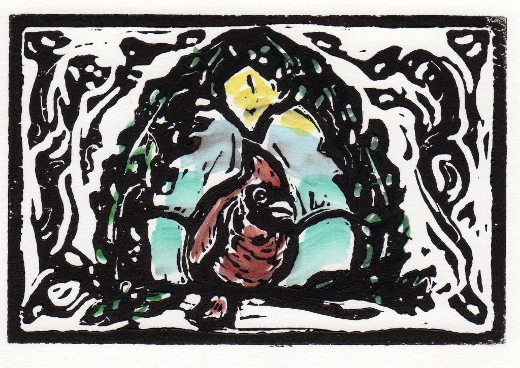
Last year I hand printed and hand tinted a couple hundred of these from a design I carved:


©Robyn Hood Black. All rights reserved.


Do you send out cards this time of year?  Purchased or handmade?  Or maybe you gather up the family for a photo card, so folks can keep up with how the children are growing?  Do you include a yearly letter?

I typically tuck in a photo of the four of us and don’t do a letter. 

Do tell – what holiday card traditions are on your kitchen table? (Or have you already gotten them out?  How organized!)
Wishing you and yours a lovely, inspiring December! 

Remember Etsy for some great, one-of-a-kind gifts.  (You can use the coupon code HOLIDAY2012 in my shop for 10 percent off!  Shhhh… don’t tell.  Nah, just kidding – you can tell your friends.)  PS – I do have free shipping on these holiday cards:


Art Break Wednesday: Woof!


My post this week for Art Break Wednesday is brief, as I’ve been covered up in dog issues among other things since last week.  So, we’ll take a peek at drawing dogs!

On the home front, we’ve been nursing an ill dog – one of our 13-year-old dachshund mixes (we have two males, littermates) is battling pancreatitis.  Back and forth to the vet, fluids at home, etc. etc.  He’s a trouper and we’re trying to get him over this episode and settled back into a routine.  Also, last Thursday night, I rescued a waif of a little creature from a very busy road in our town.  (Did not exercise the best judgment while driving to do it – thankful for those Thanksgiving guardian angels that must have been close by.)

She’s a little chihuahua.  Not even a real dog! ;0)  Actually, we’ve been unable to locate her owner and she has settled in just fine over here, charming everyone she meets.  Except one of the cats.  I look forward to having a few minutes one of these days to sit down and sketch her.

In the meantime, let me share a great little book I found a few years ago.  Our new diminutive doggie reminds me of some Disney character.  She could really be one.  While I’ll never be a Disney artist, I did grow up in the shadow of Disney World in Orlando and have always admired much of the art, especially in the classic movies.

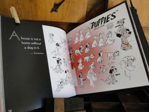
DISNEY’S DOGS, concepted and designed by Ramara Khalaf and published by Disney editions, offers a great peek into famous and not-so-famous Disney canids throughout the decades.  The book appears to be out of print now, but you might find used copies online.

This book is part history, part art lesson, and a big part fun, with inspiring dog-related quotes sprinkled throughout.  The variety of art styles and personalities of the dogs themselves is a treat to peruse.

The anonymous quote in this spread of dalmatian pups reads, “A house is not a home without a dog in it.”

As an exercise, I have found myself sketching from Disney movies to explore the construction of those terrific, expressive animals.  (I still have my set of Disney album storybooks, which I “played” literally and figuratively, incessantly as a child.  Anyone else remember those?)

Many of our classic Disney movies are VHS tapes, since my kids came along in the 90s.  You can pop one in your VCR (assuming you still have one of those!) and stop the action at any point to do a quick sketch or two.

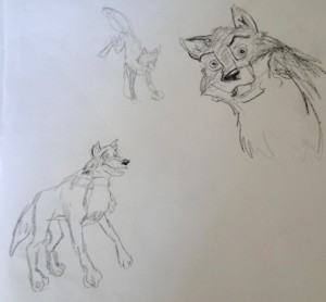
Some sketches scribbled while watching Disney’s BALTO

Or, sketch freely and quickly as the action unfolds, like a gesture drawing.


Do you have a favorite way to sketch animals?  Any favortie Disney dogs?  Thanks for coming by!

Art Break Wednesday – Thankful!


HAPPY THANKSGIVING!

This week as I count my blessings, I’m especially thankful for my wonderfully creative, generous, and supportive art critique group.

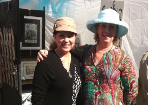
Prescott Hill, Beth Rommel, Kathleen Bradshaw, and Paula Puckett – my fabulous artists critique group!

Robyn and Kathleen

These fine folks are:  Prescott Hill, Beth Rommel, Kathleen Bradshaw, and Paula B. Puckett.

We meet once a month at Beth’s lovely home (though we’ve promised her we’ll start spreading the hosting love).  We eat, sip coffee, nibble some more, and encourage one another as we share whatever is going on in our artistic lives.  It’s not all social – each month we share whatever we’ve been working on for feedback.  I can’t tell you how much I’ve learned and how much I appreciate their keen insights!  I’m beyond thankful that I stumbled into the fold of this group as it was forming last spring. It’s made a huge difference in my creative life and has been very instrumental in my getting artsyletters off the ground.

Oh, and we sometimes take field trips, too.  Of course, we can all be found at SCBWI Southern Breeze events, but we like our own side trips as well.

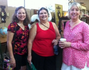
Here we are shopping researching markets and digging up inspiration and treasures at the Flowery Branch (Georgia) Antique market.


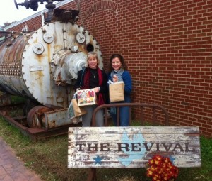
And Beth and I are shopping  researching and gathering art-making supplies yet again this past weekend in Buford, Ga., at the Revival Antique show.


We call ourselves “Harold’s Friends” after Beth’s cat, who usually deigns to supervise each meeting at some point.  I’m thankful for these friends and wish, for everyone who creates, a talented, honest little band of folks who speak the same language and encourage them on the journey.


Art Break Wednesday: Mini Ott Light Give-away – the Better to See you With!

Yay Images

 Perhaps THE most important resource a visual artist has is light.

I’m lucky to have two windows in my office/studio.  Neither one faces north, from which streams the best light for artists so they say, but I’ll take them. I also have overhead lights which came with our circa ’70s house, and which now have compact fluorescent bulbs in them, a few lamps with various types of bulbs, and a couple of those clip-on task lamps for my drawing table and big work desk.

My favorite one of those is my flexible Ott task lamp which hovers over my small drafting table.  It offers a high quality of light which seems most like daylight to me.  Even so, especially if I’m working with color, I prefer to produce art during the day than at night.

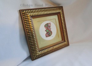
Does that have anything to do with my nearing-50-year-old eyes?  Probably.  Also, I have to wear reading glasses for close-up tasks now, and pay attention to small details.  Case in point: One recent evening, I made a couple of illuminated letter “S’s” in an Ottonian style, in which gouache is used inside and around the gold leaf.  I put them in vintage gold frames, whose double mats I painted gold, and sold one at an art show.  The other I photographed to list on Etsy.

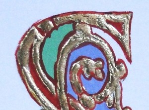
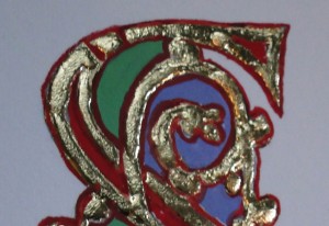
Now the letter, only 2 inches tall and 1 1/4 inches wide was not perfect, but it looked fine to me at a small distance.  I don’t mind slight variations in hand-lettered art – that can add to its charm.  But when I uploaded the photographs and my little letter was magnified dramatically on my computer screen, I saw a couple of areas I couldn’t live with.  The red gouache had been thinned just a bit too much and left a drippy effect near the top of the letter (and I’d missed a wee spot elsewhere to boot!).

Detail – illuminated S with drippy outline

I carefully un-framed the letter and took it back to my drawing table.  Daylight, and this time a magnifying glass, did the trick.

That’s better!

I touched up the areas, took new photos and reframed the piece, and now it’s up on Etsy.

Illuminated S ©Robyn Hood Black

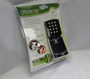
I’ve also discovered that for fine work, I enjoy using a mini Ott flip light right beside whatever I’m working on.  It can be clipped to the side of a small box or jar or piece of matboard to illuminate a project while I’m working.  I like these so much, I bought one to share with you!  Just leave a comment by midnight EST Monday night, Nov. 19, sharing what kind of light you like for  your work or hobby, and you’ll be randomly entered to win.

A fun way to brighten your day!

In other news, I’m beyond honored to be featured today on Julie Hedlund’s terrific blog, talking about writing and artsyletters.


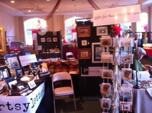
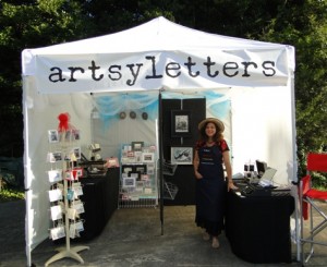
Art Break Wednesday: Let’s Talk Displays


‘Tis the season for holiday marketplaces.  This past weekend, I had the privilege of exhibiting and selling my wares at the All Saints Fall Festival,

Thanks, Brother-in-law!

a church-sponsored art and gift show benefitting the youth of All Saints Episcopal Church in Atlanta, where my brother-in-law Tim happens to be a new priest working with the youth.  (Thanks for letting me know about the show, Tim!)


This was the first time I’ve done an art show in an indoor venue.  Ahhh – no worries about wind, rain, or fluctuating temperatures!  I could get used to that.  The space was smaller than the standard 10 X 10 outdoor show space, but I culled some items and squeezed in a bit.


Probably my favorite investments for the few shows I’ve done this fall have been:

A decent tent.  I ordered a Caravan tent and have been please with how sturdy it is and how nice it looks.  It was pricier than what you’ll find at WalMart, but I think it’s worth it.

Decent panels.  I  knew I wanted a couple of panels to hang framed pieces on, and I did some online research.  The Pro Panels system seemed to get consistently good reviews.  I took my hubby to a couple of art shows and had him help me compare the carpet colors on Pro Panels in different exhibitors’ booths!  We liked the dark gray the best, so that’s what I ordered for mine.  I’m glad I got the six-foot ones (not the very tallest) because I can just squeeze these into the back of my 2004 Honda Pilot.

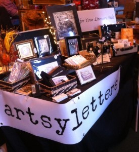
A narrow display table (and a smaller one as well).  I found a lightweight long, narrow table for trade show use and it’s been a great investment and easy to carry and set up.  Google “trade show displays” and compare items from different vendors. Also, shop around online for a good price on table cloths.  I opted for classy old black.  (If they’re a bit large, just tuck them up and in with bulldog clips or safety pins.)

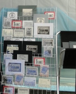
Magazine racks.  I found lightweight folding magazine racks online and they’ve been great to set up displays of cards and small items in the outdoor tent spaces.  It’s easiest to keep them in the box for transport, because those wire “shelves” will otherwise catch on everything.  A folding display rack (lightweight metal legs and canvas) available from online art supply stores is perfect for matted prints.

Banners.  I had a canvas banner made to stretch across the top of my tent with “artsyletters” big enough to catch the attention of folks walking around.  Then for this indoor show, I had one made about half that size to stretch across my table.  I read recently that it’s great to have your business name outside your booth AND inside of it, so I’ll keep using both.  In my neck of the woods, you can get a nice long banner for less than $100 and a shorter one for less than $50 at local sign/printing shops.

Signs.  After putting up a couple of hand-made ones, I had a few smaller signs made with real typesetting with phrases such as “Art for Your Literary Side,” “Gifts for Readers and Writers,” “Teacher Gifts,” and “Book Club” printed on them.  They’re printed on a strong foam core type base, so they are not indestructible – but they’re lightweight and can be stuck any place with Velcro.

Lights.  I’ve gotten positive comments on some delightful little battery-operated strings of lights I picked up at a shop in Greenville, SC.  Should have gotten more.  They were about $10 apiece and you can bend or wrap them around anything.  I also use a few battery-operated “eye” lights I can twist around the tops of the panels.  Found some on clearance at Office Depot and a couple more at Target.

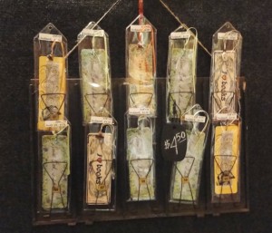
Vintage, repurposed items.  For my bookmarks, I found two vintage metal receipt holders.  These would have been used years ago in a general store for families to keep track of their running tabs.  They weren’t cheap – maybe $35-$40 apiece? – but they are so unique and they draw customers in to investigate.  They also perfectly display the bookmarks.

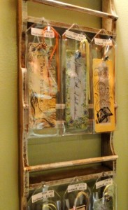
Also, I found an chic-shabby shallow hanging shelf with great chippy paint.  It fits right beside the receipt holders on one side of my panels.  A few small nails in the outside edges of the racks, and, Voilà!  More bookmark display space.

Oh – and when I display small refrigerator magnets, a small mid-century metal vanity shelf I found in an antique store does the trick!  It even has little sliding doors I can store more inventory in, and it’s a nice height for the table.


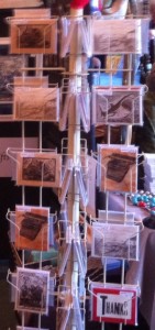
Probably my favorite item is an old spinning card rack I got many moons ago from a store closing its doors.  It holds 48 packs of cards and is narrow enough for easy transport, plus it comes apart and is easy to set back up.  And you can put a sign on top! (I’d given this to my son, now 17, to put his baseball caps on – then took it back when I started my art business this fall.  Sorry, Seth.)

I transport my items for sale in plastic tubs that can be stored under my tables.  Remember, rain makes all the ground wet!  So you don’t want cardboard boxes as your only storage option.

The cost of setting up a travelling shop can be a little daunting, but sales at my first couple of shows this fall just made up the cost of display fixtures.  I think it was a good investment.

If you’re an exhibitor, what do you think are the most important things to think about when setting up for art shows?  Do you have some favorite ways to display your work?

Do tell! :0)


Art Break Wednesday: Happy Halloween!

Wishing you and yours more treats than tricks.

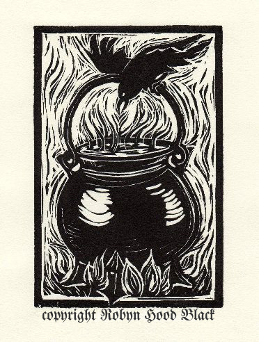
What makes certain images spooky?  Subject matter, of course – but it’s also color, quality of line, and what the piece conjures up in the imagination.

I carved the above relief print to accompany a poem I wrote for Jama Rattigan’s amazing blog, Alphabet Soup.  I was honored to be one of her guest poets for April. The poem is called “Spooky Brew.”

My brother and I LOVED Halloween growing up.  We turned our suburban home into a haunted house every year and the neighbor kids piled through.  Our wonderful mom played right along – I think she enjoyed it as much as we did. (Thanks, Mom!)

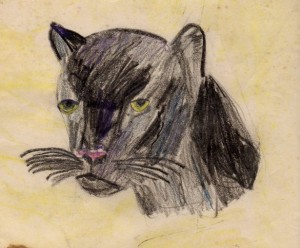
I can remember drawing Halloween pictures as a kid – witches on brooms, black cats, jack-o-lanterns.

I’ve always had a thing for black cats. This one is actually a panther, I guess, but it was all I could find handily. I must have drawn it at about age 10 or 11.

These all had sharp edges and bold, jagged, pointy lines.  Mwwahahahahahaha….


And somewhat related, a confession:  my brother and I were afraid of a certain letter Y in the Encyclopedia Britannica.  (Remember that, Mike?)  I think the top of it was curved in some way.  Whatever it looked like, it spooked us!  That’s likely one reason I’m so crazy about lettering and fonts and such to this day.  There is great power in a few strokes of black, a few marks on paper.

Whose spooky art do you admire?  Edward Gorey?

Maybe some of Tomi Ungerer’s?

Tim Burton?

Share your thoughts below!  (No tricks, now….)

Here are some more  frightfully wonderful suggestions from your comments:

Bernie Wrightson

The terrifically talented Toni deTerlizzi

I’ll toss in another – the work of Mary GrandPré on the Harry Potter …more?

Art Break Wednesday: Painter and Illustration Contest Winner Beth Rommel!


This past spring, I had the lovely good fortune to fall into a wonderful artists’ critique group.  We met through our amazing SCBWI Southern Breeze region.  I’ll share more about our small band in future posts  (Beth Rommel, Kathleen Bradshaw, Prescott Hill, Paula Puckett, and yours truly).

Beth Rommel

Beth came to see me at Mule Camp!

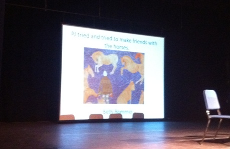
TODAY, I want to celebrate our “fearless leader” – or, at least, the one of us brave enough to host us in her home each month and keep our calendar on track. Why are we celebrating?  Because BETH ROMMEL just won first place in the SCBWI Southern Breeze 2012 illustration contest, as announced this past weekend at our fall conference in Birmingham!  Woo-hoooo!!!!!  The contest was judged by Debra Kaplan, Vice President and Executive Art Director at Penguin Young Readers.  (Yes, you should be impressed!)

Beth came to the Atlanta area in June 2011.  She grew up in Louisiana, and her work has been widely exhibited in Texas and the Southwest, and in Florida, where she later lived.  Her work experience includes graphic design, editorial, production, public relations, and education.  Now you can find Beth and her wonderful paintings here in Georgia!

The prompt for this year’s contest (coordinated by our own Kathleen Bradshaw, by the way) was:  “PJ tried and tried…”

Wouldn’t you know it, Beth was not able to attend this weekend because she was the special guest at another art event in Atlanta featuring her oil paintings. So I snapped a quick picture on my iPhone of her work up on the BIG screen:

image ©Beth Rommel. All rights reserved.


Here’s a better picture of her painting:

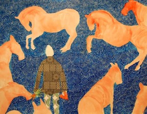
“PJ tried and tried to make friends with the horses.” ©Beth Rommel. All rights reserved.

Beth kindly offers this peek into how she created her winning picture:

I am so surprised to have won this because as a painter my style is very different from traditional children’s book illustration, which I really admire.

In coming up with a way to complete the prompt “P.J. tried and tried” I spoke with fellow artist Prescott Hill who said he was trying to remember things he had done as a child.  I was always doing something with horses in my childhood, riding them, showing them, trying to catch them in a field, make them my friends (carrots and apples always helped that process). 

Because of that constant contact their form is intuitive. It is well embedded in my Visual Catalogue, a term I coined recently. (I define it as a registry of the images kept in one’s mind. The images are derived from experiences of all descriptions.) I wanted to convey the feeling of being in a field surrounded by horses, some are friends, some are a little wild, some threatening, and others completely ignore you. This whole cast of characters I knew as a child. Wearing mismatched clothes was not an issue in the country early in the morning when all I wanted to do was get outside and get on a horse. In my dad’s big jackets or a flannel shirt I would walk the wet fields in Louisiana trying to track down these creatures and hope they wouldn’t run away before I could catch one for the ride home.

I used a palette of mixed media: acrylic paint, white ink, collage papers on coldpress 140 lb. watercolor paper. The original is proportionally twice the size as the final printed piece as I work better in a large format. I have tried to imagine what it would have been like to see my horses on a large screen at the conference! I sure wish I had been there; thank you again for sending me the photo. I am walking on air.

Thanks so much for this behind-the-scenes look, Beth!

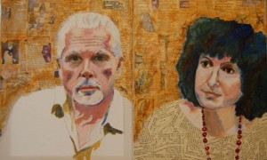
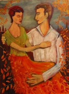
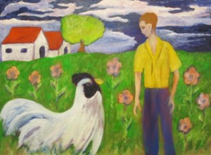
Here is a taste of some more of Beth’s vibrant works.  These are all oil paintings.

portraits: Co-Directors of the World Shakespeare Project. ©Beth Rommel. All rights reserved.

Admired Woman. ©Beth Rommel. All rights reserved.

Nancy and Andy. ©Beth Rommel. All rights reserved.


The Big Chicken was Back Again. ©Beth Rommel. All rights reserved.

Can’t wait to see what else Beth has in store.  You can keep up with Beth at her new art blog,  bethrommel.com.

What feelings does Beth’s artwork evoke in YOU?  Let her know in your congratulations in the comments!